Taking Real-Time Broadcast Monitoring Off The Rack
Pulse brings Telestream’s IP video, timing, and alarm monitoring into a single web application. I led the design of an experience that lets engineers see and configure their hardware from any computer, while everything stays on the customer’s own secure network.
RoleLead Product Designer
ResponsibilitiesProduct audit, customer interviews, personas, information architecture, interaction design, high-fidelity design, usability testing, and design handoff.
Usability Testing Results
91average SUS score
Average System Usability Scale score across usability tests of each feature area.
86%average actual completion rate
Share of tasks participants actually completed across usability tests of each feature area.
2m 27saverage time on task
How long participants took to complete each task across usability tests of each feature area.
4.2average difficulty rating
How difficult participants rated each task across usability tests of each feature area.
01
Every Answer Lived At The Rack
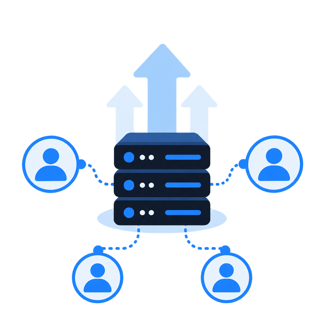
Telestream’s IP monitoring lived in two places: Inspect 2110, a browser-based probe interface, and PRISM, a waveform monitor whose interface ran on the hardware itself. To check a signal or change a configuration, engineers often had to be standing at the device. Pulse set out to bring these capabilities into one web application that connects to the customer’s hardware and runs entirely on their own servers and network, with no internet connection, so sensitive media and data never leave the facility.
Design Problem
Critical signal data was trapped behind the hardware
Viewing or configuring a device meant going to the device.
Monitoring was split across Inspect 2110 and PRISM.
Dense tables gave every metric the same visual weight.
Alarms signaled a problem without the context to act on it.
Interfaces were organized around specifications, not tasks.
Business Problem
Customers needed remote visibility without exposing their network
Engineers work across control rooms, equipment rooms, and sites.
Security policies keep media networks isolated from the internet.
Two products meant two learning curves and two roadmaps.
Facilities moving to ST 2110 needed a modern IP monitoring toolset.
Hardware-bound interfaces limited how far a single unit could scale.
02
Two Powerful Tools, Built Around The Hardware
Before talking to customers, I reviewed the Inspect 2110 and PRISM interfaces that Pulse would replace. Both were powerful, but they were built around the device rather than the person using it. I treated what I found as hypotheses to test in customer interviews.
Key Learnings
01
The data lived at the device
PRISM’s touchscreen interface meant that diagnosing an issue often started with walking to the rack.
02
Everything carried equal weight
Uniform tables of packet counts and stream parameters made the one value that mattered look like every other.
03
Alarms stopped at “something is wrong”
A red Critical banner flagged a problem, but not which stream, when it started, or what to check next.
03
Listening To The People On Call
7
customer interviews
I asked customers how they monitor live IP signals today, where they lose time during an incident, and what they would need to trust a browser-based tool with on-air monitoring. The same needs kept surfacing across very different roles, and each one became a design opportunity that shaped a part of Pulse.
Broadcast engineers
IT & IP network specialists
Video shaders
What Kept Coming Up
01
What we heard
See every device from one place
Engineers pieced together a signal’s health from the rack, Inspect, and separate tools that didn’t integrate.
→
Design opportunity
A configurable dashboard of live video, audio, waveform, and vector tiles, sourced from any connected device.
02
What we heard
Separate critical alarms from noise
Too many alerts looked urgent, so engineers lost time during an incident working out which ones really were.
→
Design opportunity
A severity-first alarm summary with counts, filters, acknowledgment, and grouped occurrences, shown beside the data it relates to.
03
What we heard
Bridge IT and broadcast data
Network specialists lacked media context in their IT tools, while broadcast engineers lacked network context.
→
Design opportunity
An input view that pairs video, audio, and ANC vitals with IP sessions, SFP details, and timing on the same page.
04
What we heard
Diagnose timing issues over time
Multicast and PTP problems came and went, and were hard to understand from a single snapshot of values.
→
Design opportunity
Per-port timelines, a live and historical time range, and a clear record of when each value last changed.
05
What we heard
Share context during incidents
Findings lived in people’s heads, and incomplete documentation meant the next person started the investigation over.
→
Design opportunity
Comments pinned to a moment on a graph, plus CSV and image export for reports and handoffs.
06
What we heard
Stay inside the secure network
Protecting sensitive media and data was non-negotiable, so remote access couldn’t mean sending anything to the cloud.
→
Design opportunity
A browser-based experience deployed on the customer’s own servers, with no internet dependency.
The takeaway
Give engineers the whole picture from any desk, without leaving their secure network.
Engineers didn’t want less data. They wanted to see every signal in one place, know which problems mattered, and understand them quickly, on both the broadcast and network side.
04
The Engineers Behind Every Broadcast
Personas
I synthesized the interviews into three personas that anchored design decisions across the product: two primary personas who share responsibility for the signal and the network that carries it, and a secondary persona focused on how the picture looks on air.
Primary PersonaBroadcast and media workflow engineersResponsible for error-free live output and measured on downtime. They needed to resolve problems quickly, without being tied to a single piece of equipment.
Drake keeps live broadcasts running. His goals center on minimizing downtime and glitches during live events. His pain points were frequent equipment issues during broadcasts, time-consuming manual workflows, and difficulty integrating the many tools he already relied on.
Primary PersonaIT and IP network specialistsResponsible for the network that carries the media. They needed packet loss, latency, multicast, and PTP data in one place, alongside the broadcast context their IT tools could not show.
Edna keeps the facility network healthy under pressure. Her pain points were fragmented tools that did not integrate, alerts that were not actually critical, limited visibility into media-specific traffic, and hard-to-diagnose multicast and timing issues.
Secondary PersonaVideo shaders and coloristsResponsible for how every frame looks on air. They relied on waveform and vector scopes and needed advanced HDR analysis without a complicated interface.
Daniel paints and balances cameras during live events and grades content afterward. His needs centered on real-time waveform and vector tools, and his pain points were unintuitive HDR tooling and balancing creative decisions against technical standards.
05
Bringing The Rack Into The Browser
I translated the research into four connected areas of the product, all built on a shared navigation and design language. Together, they let engineers build the view they need, dig into any input or timing source, and move from an alarm to its cause without leaving the browser.
Configurable Dashboards
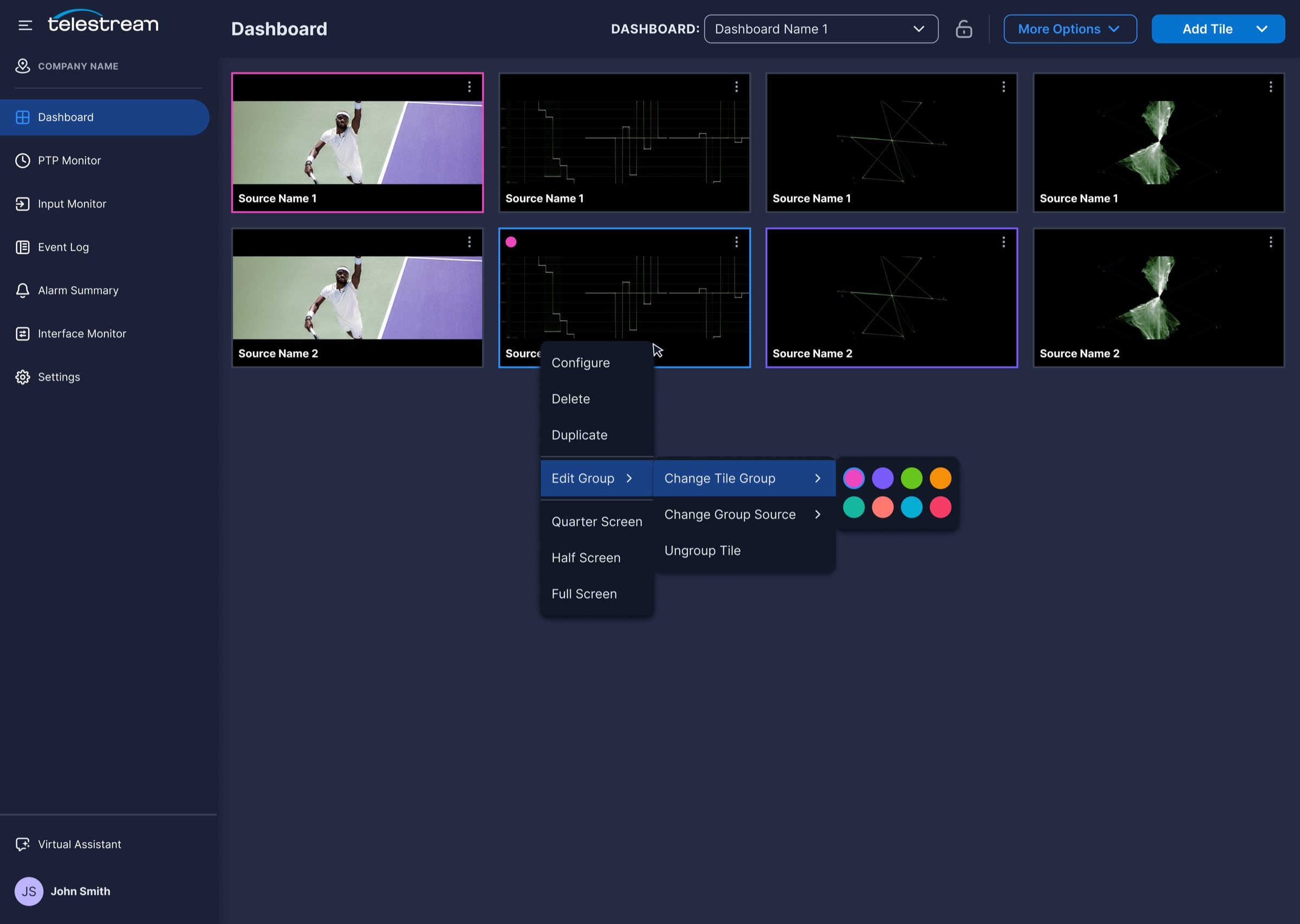
PRISM showed one scope at a time on the hardware’s own screen. The Pulse dashboard turns that into a grid of live tiles that engineers arrange, configure, and group for the way their facility works.
Research signal
Engineers needed to watch many sources and scopes at once, from anywhere.
Design response
A grid-based dashboard of video and scope tiles, configured in a side panel and saved per team.
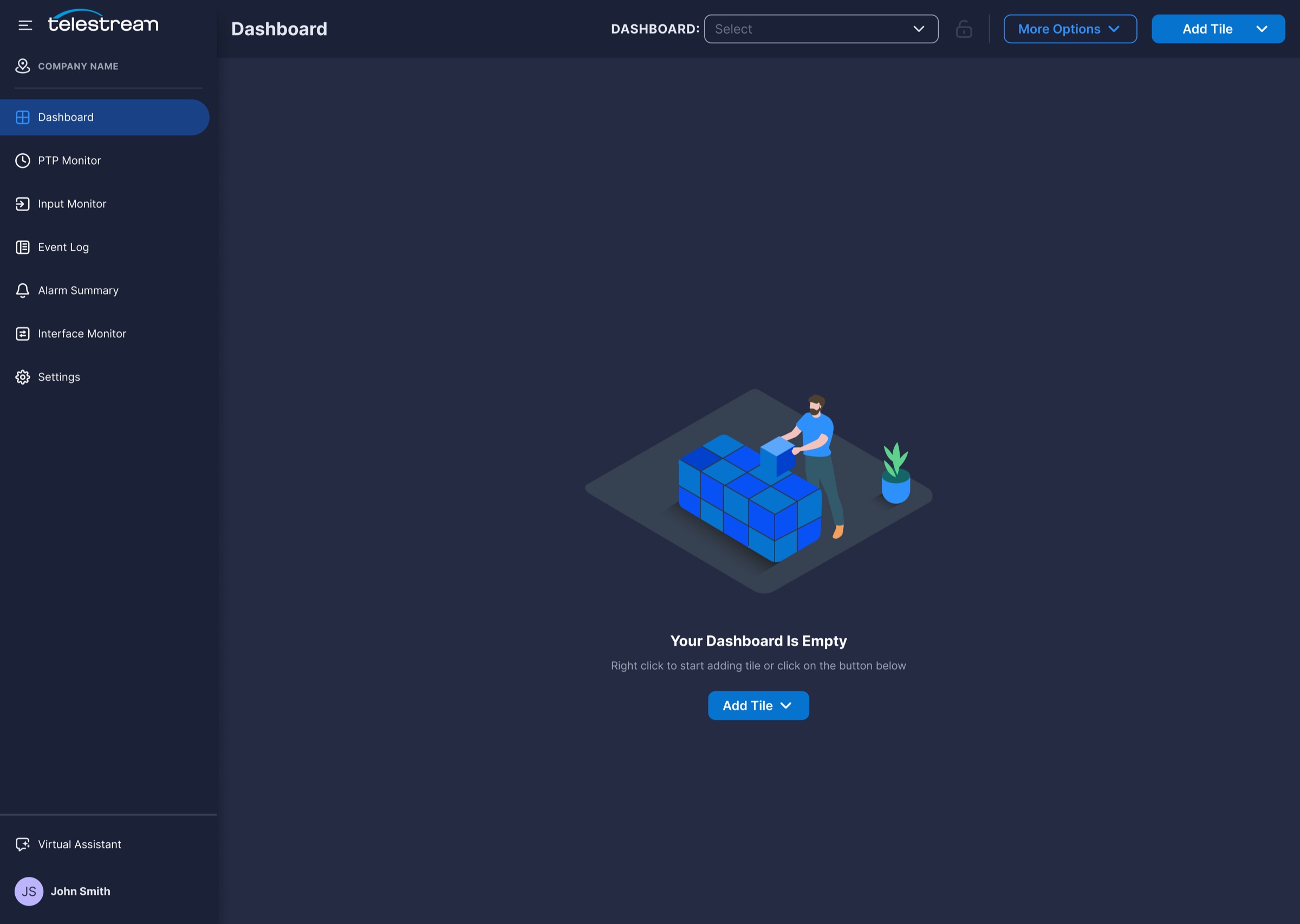
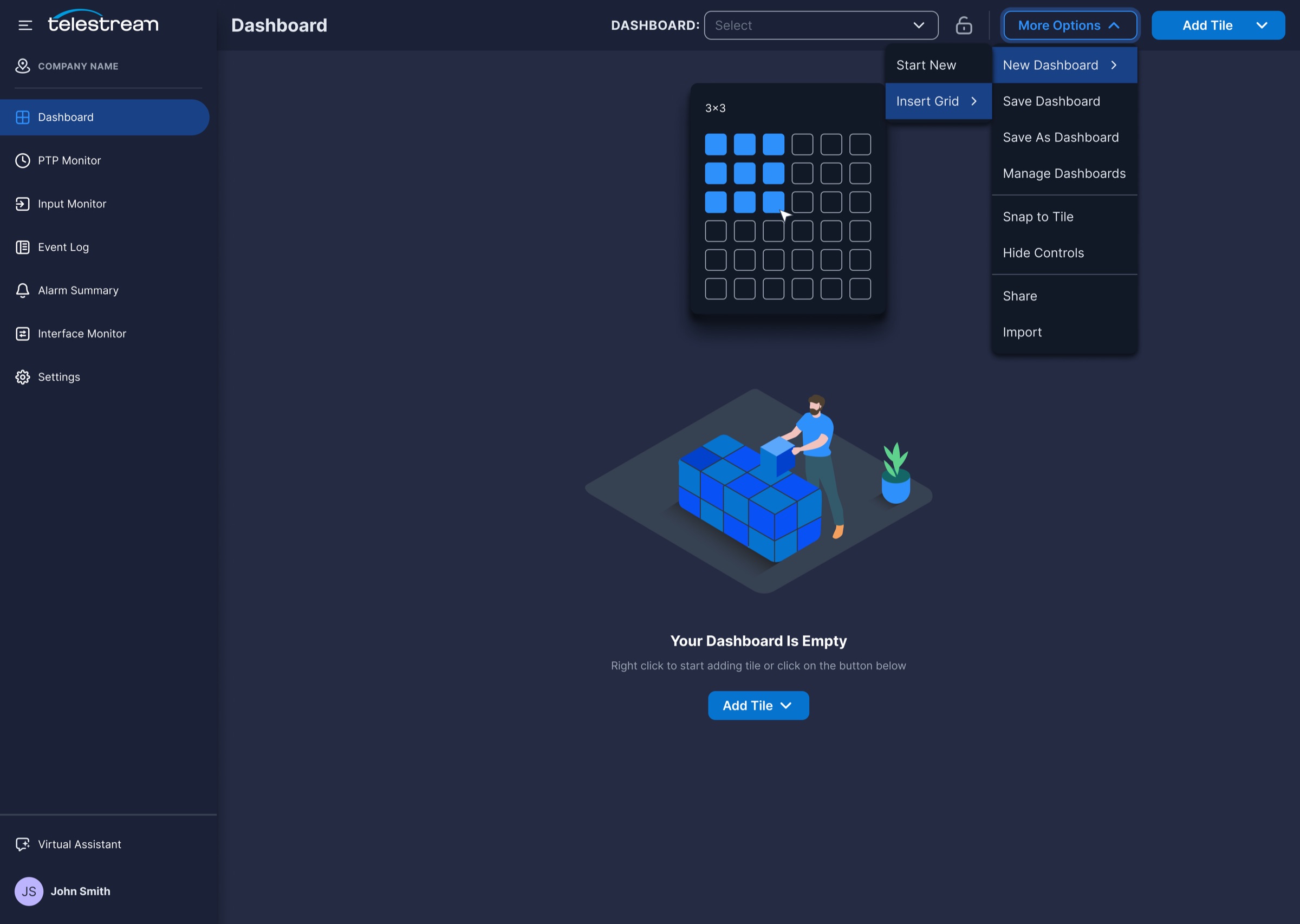
Start from an empty state or insert a grid, then add tiles by right-clicking or using Add Tile.
02
Video And Scope Tiles
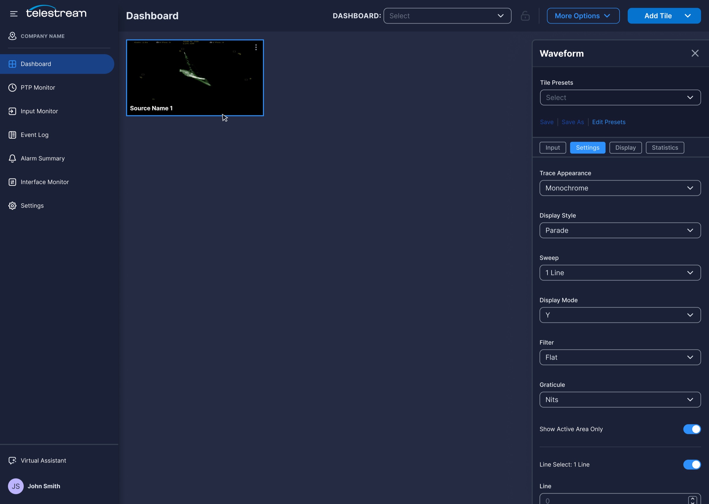
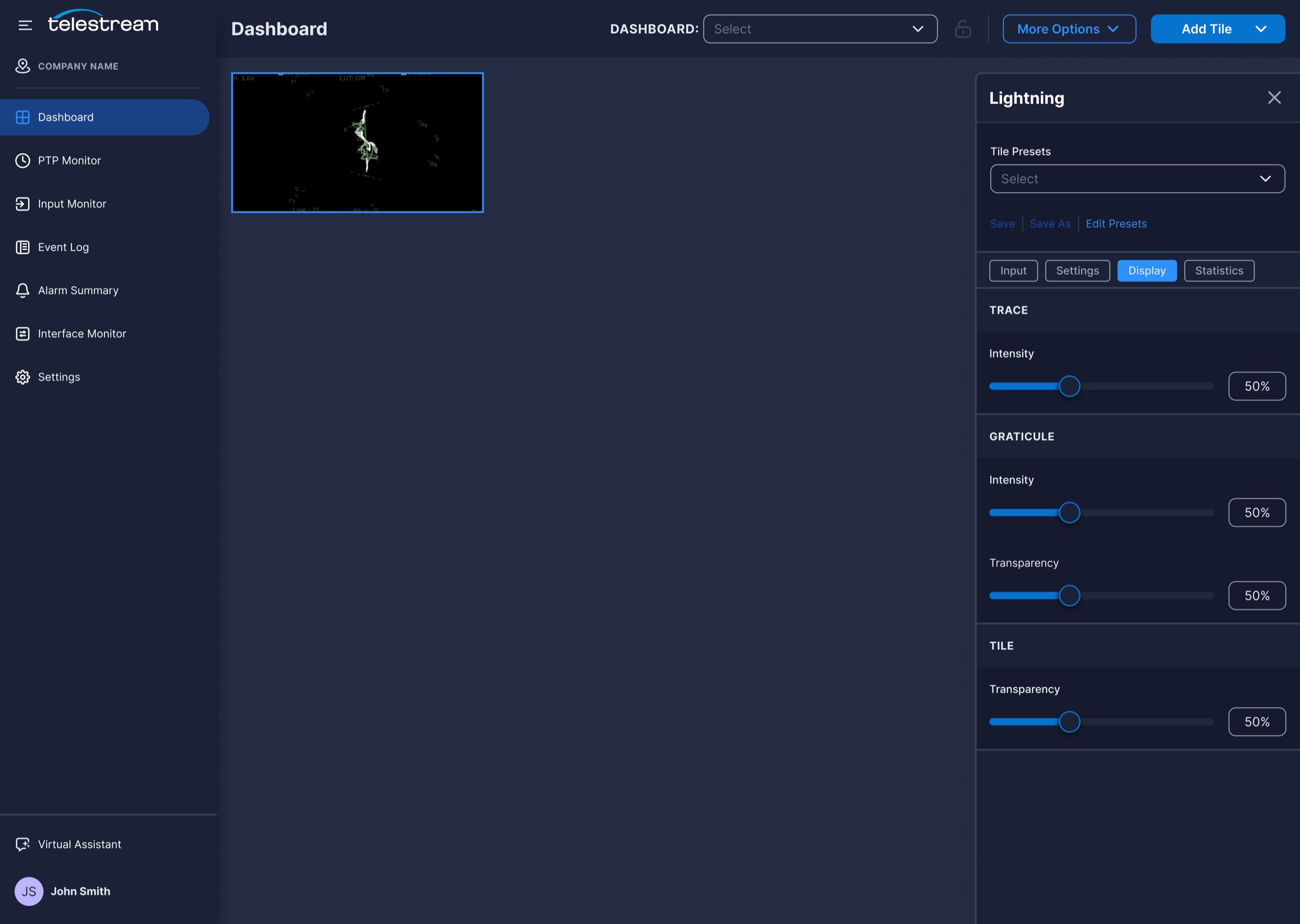
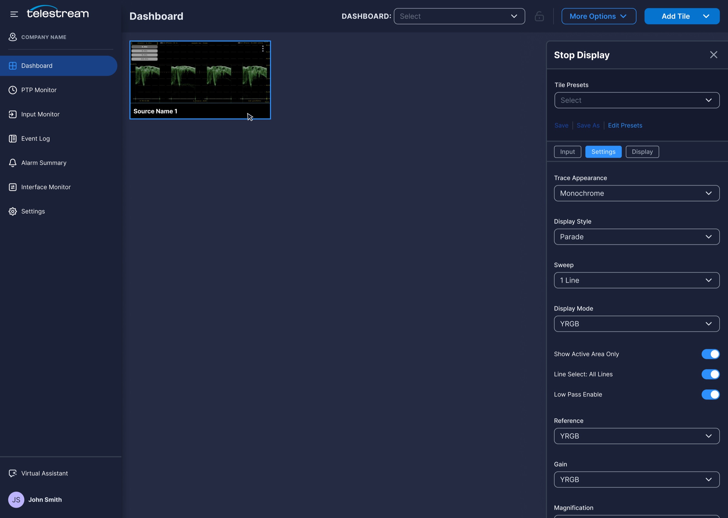
Picture, waveform, lightning, and stop display tiles bring PRISM’s scopes into the browser, side by side.
03
In-Context Tile Settings
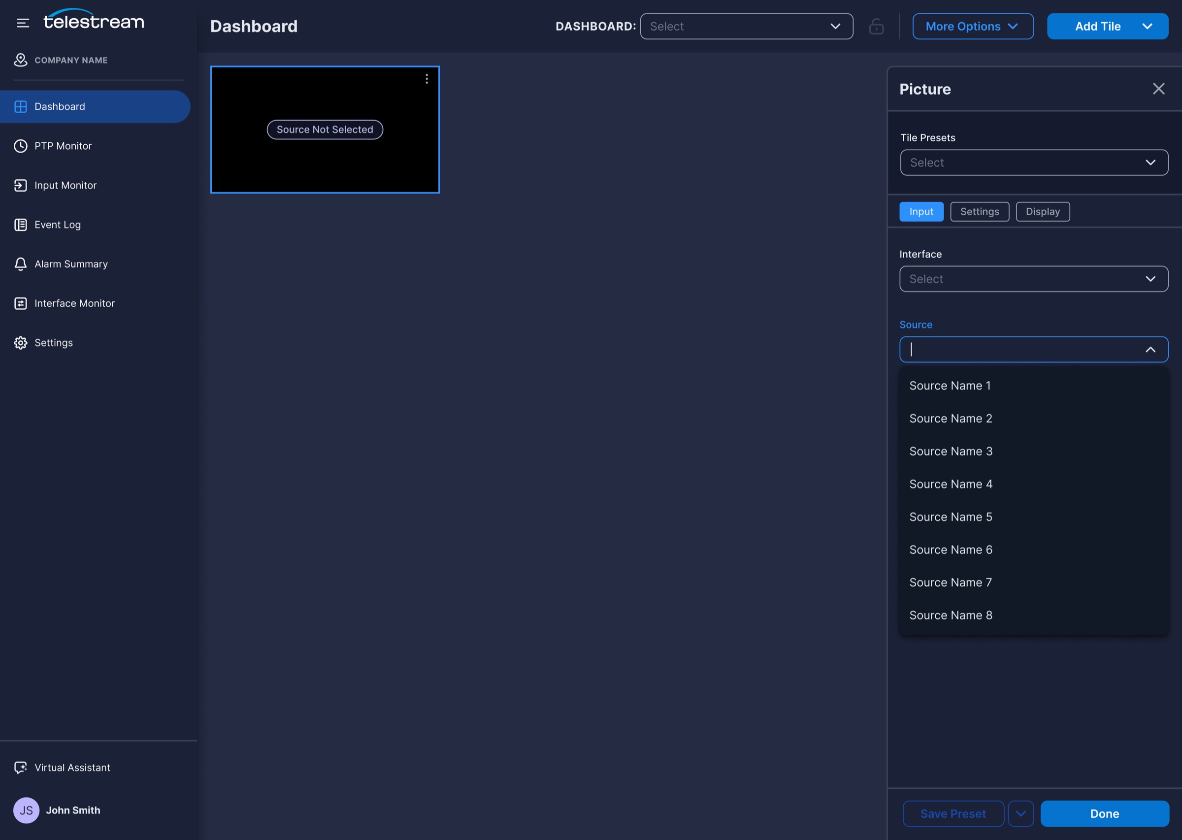
A side panel organizes input, settings, display, and statistics into tabs, with presets that can be saved and reused.
04
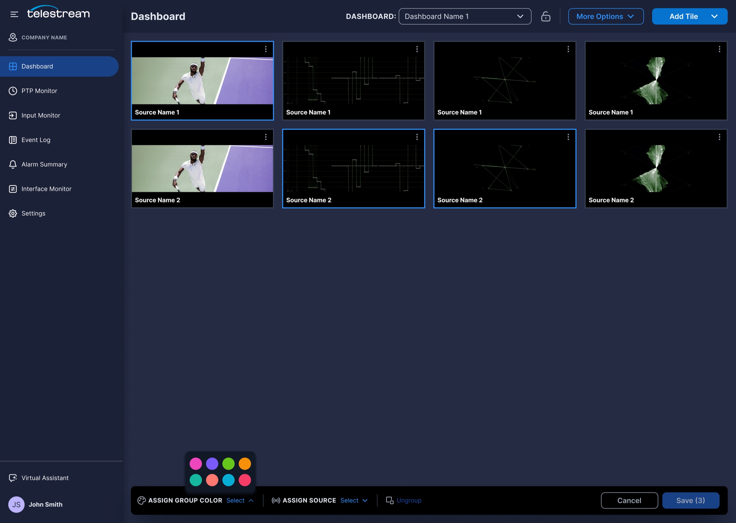
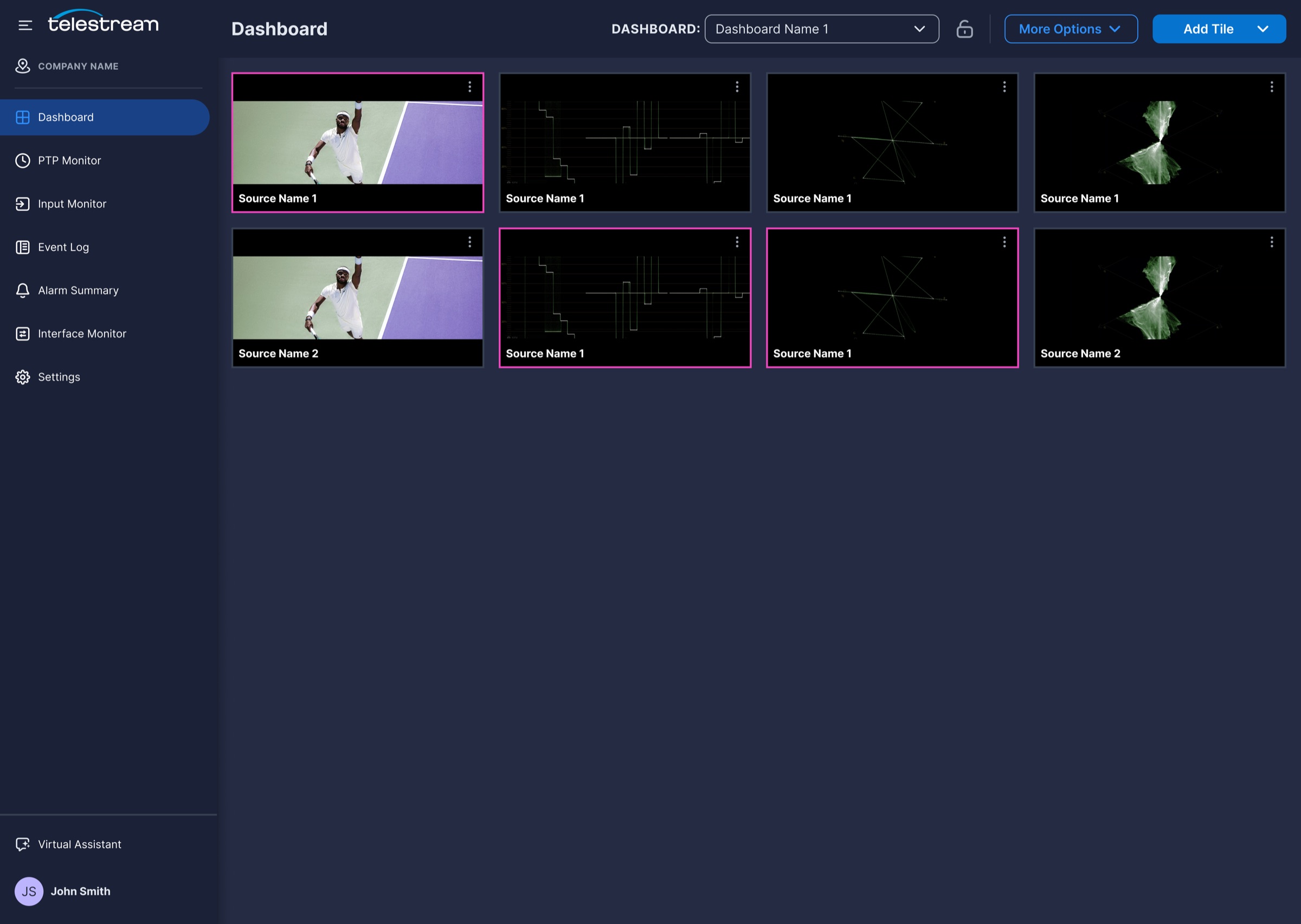
Color-Coded Tile Groups
Select several tiles to assign a group color and a shared source, so related views change together.
05
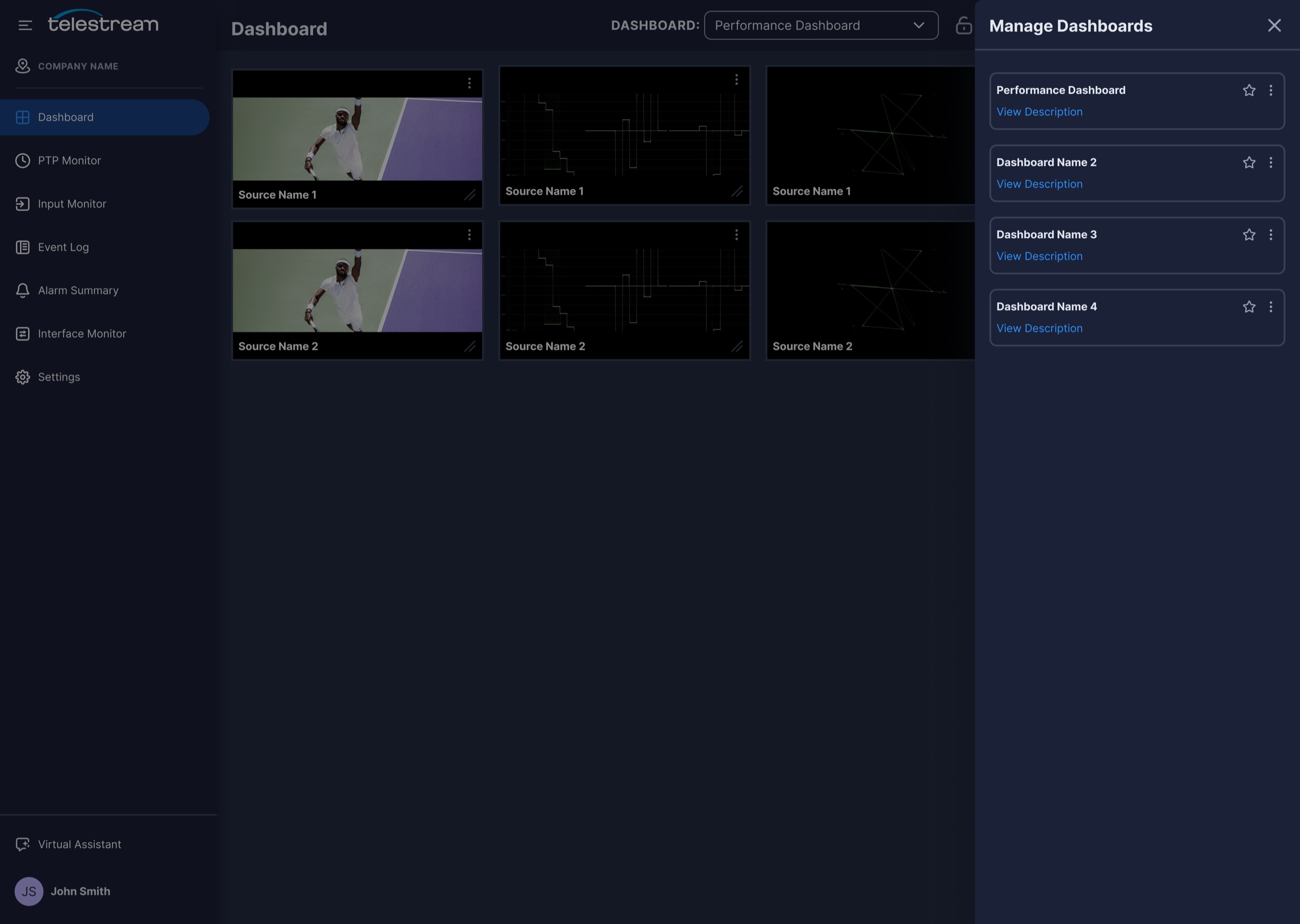
Saved And Shared Dashboards
Save, favorite, share, and import dashboards so each team keeps the views that match its role.
pulse.local
Input Monitor
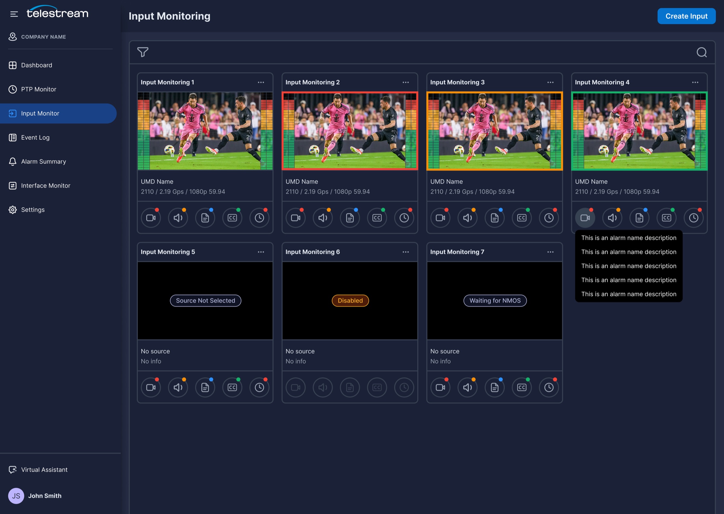
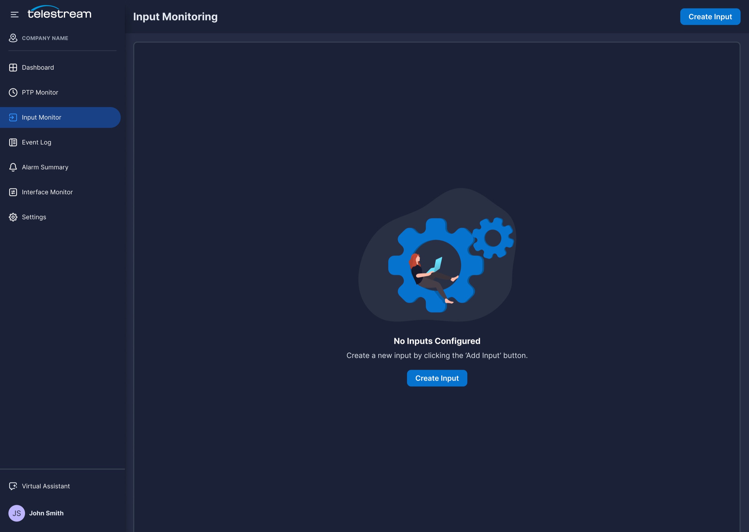
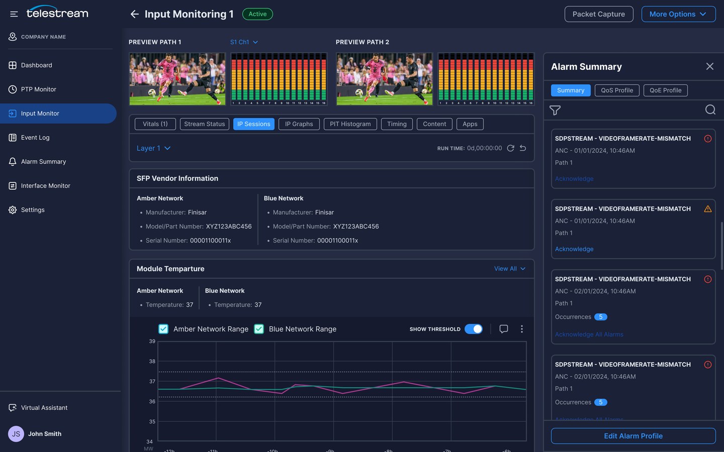
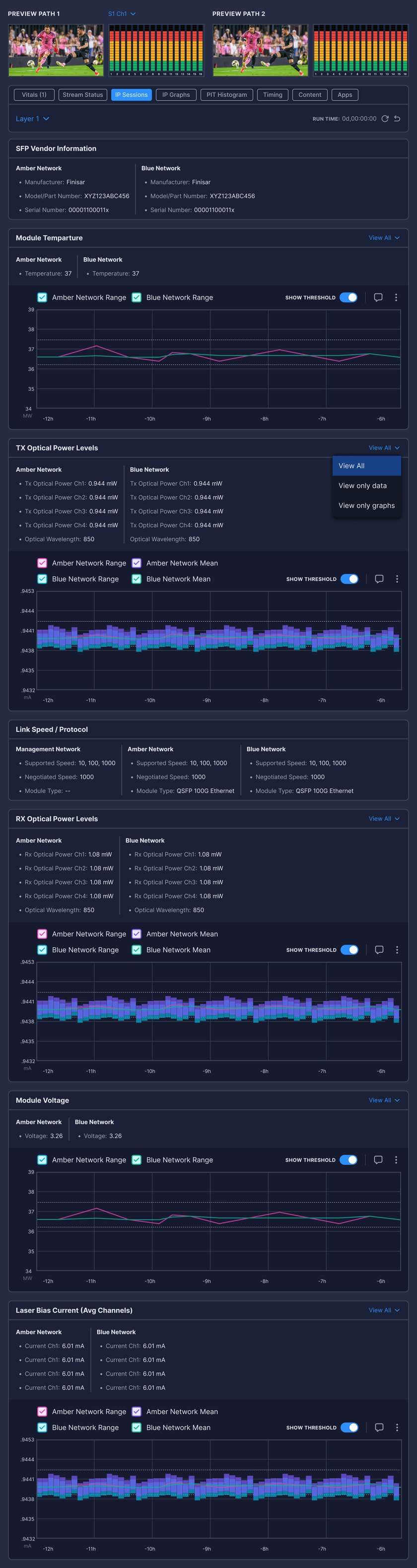
Inspect 2110 presented each stream as long tables of equally weighted metrics. The Input Monitor starts with a status-first overview of every input, then opens into tabs that pair signal vitals with the network details behind them.
Research signal
Broadcast and IP specialists each saw only half of the picture.
Design response
Input cards that show health at a glance, and a detail view that connects signal, network, and alarms.
Key features
Status cards · Guided setup · Vitals · IP sessions · In-context alarms
01
Status-First Input Cards
Each input shows a preview, its format, color-coded status, and alarm icons, plus clear states such as Disabled or Waiting for NMOS.
02
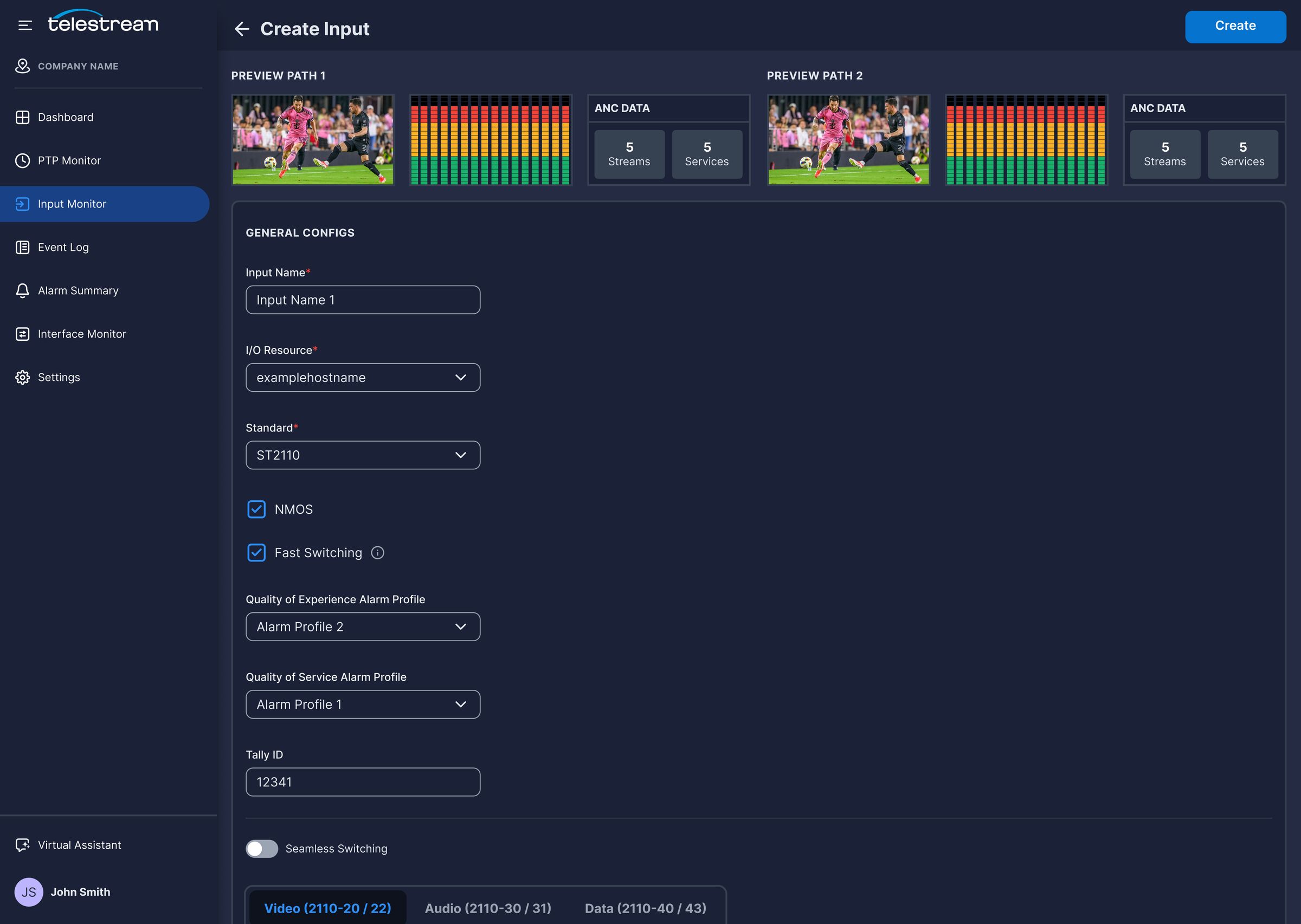
Guided Input Creation
One form covers the resource, standard, alarm profiles, and 2110 streams, with live previews of both paths as you configure.
03
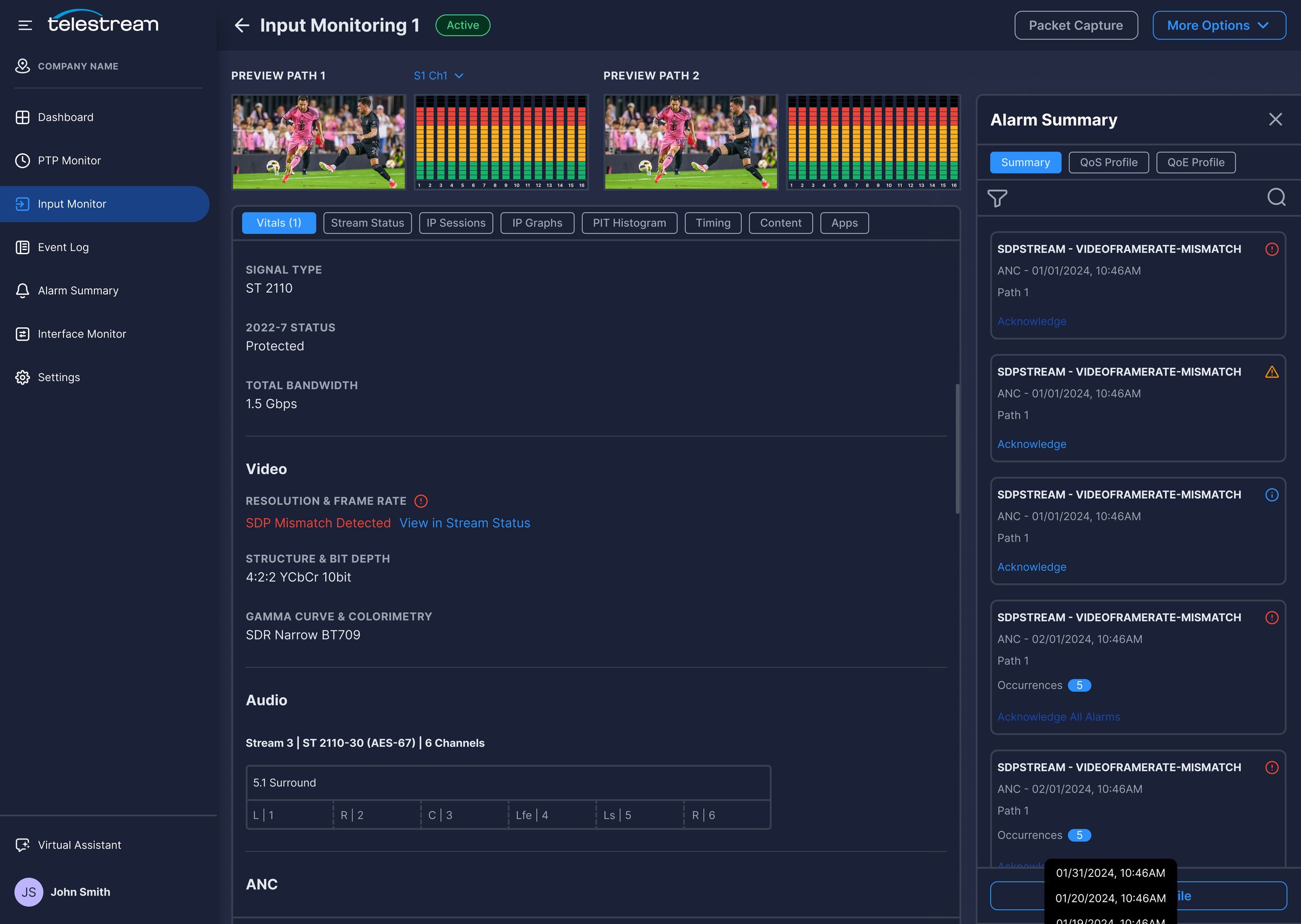
Vitals At A Glance
Signal type, redundancy, and video, audio, and ANC details are summarized first, and mismatches link straight to the stream that caused them.
04
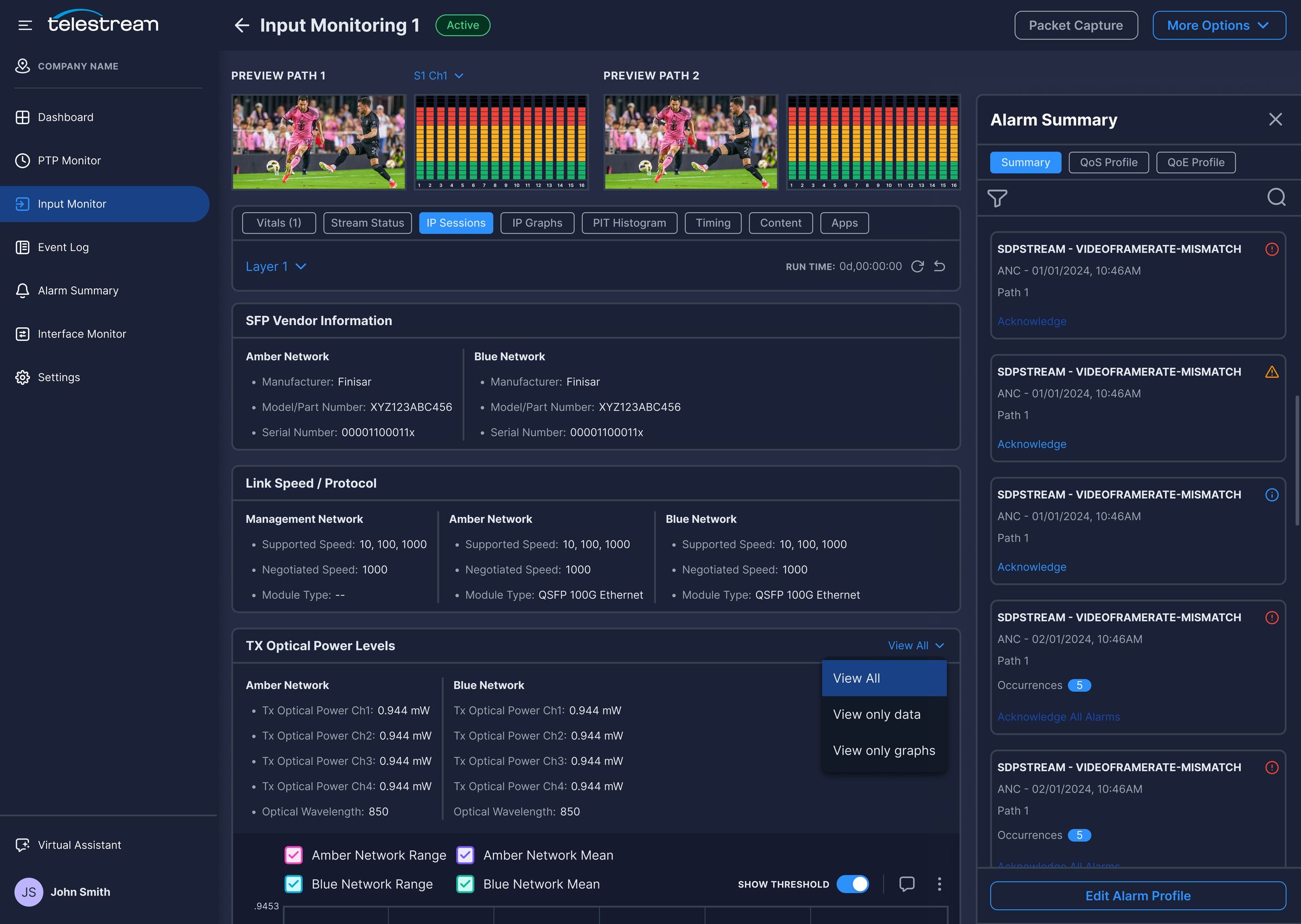
Network Detail Alongside Signal
IP sessions show SFP vendor details, link speed, and optical power for each network, as data, graphs, or both.
05
Alarms In Context
An alarm panel sits beside the input, so engineers can acknowledge issues without losing their place in the data.
pulse.local
PTP Monitor
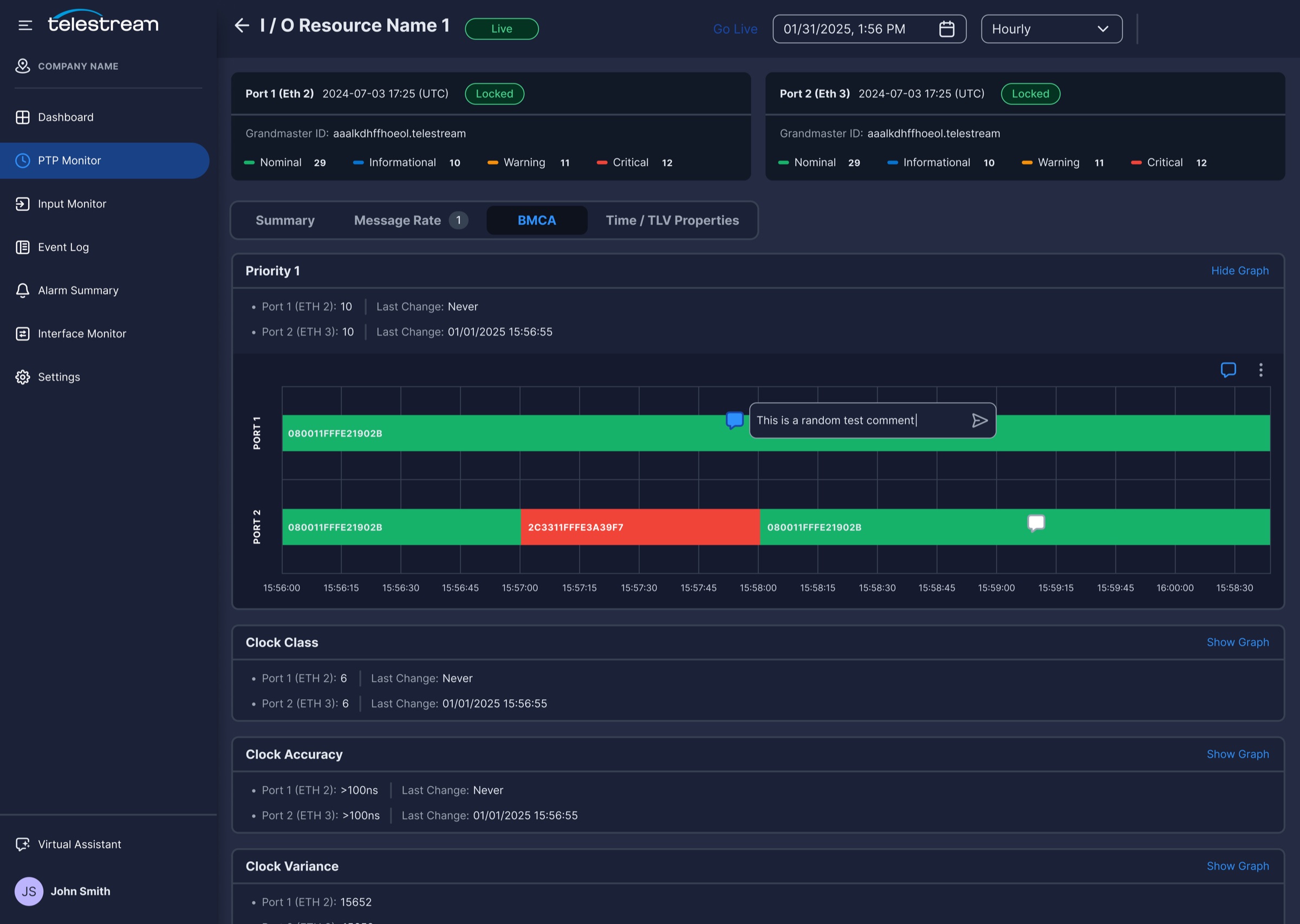
Timing problems are often intermittent, so a single snapshot rarely explains them. The PTP Monitor shows lock status and alarm distribution up front, then lets engineers trace each port’s behavior over time.
Research signal
Multicast and timing issues were among the hardest to diagnose.
Design response
Status cards for each PTP resource and time-based graphs that show exactly when and where things changed.
Key features
Monitor cards · Alarm setup · Port timelines · Live and history · Collapsible graphs
01
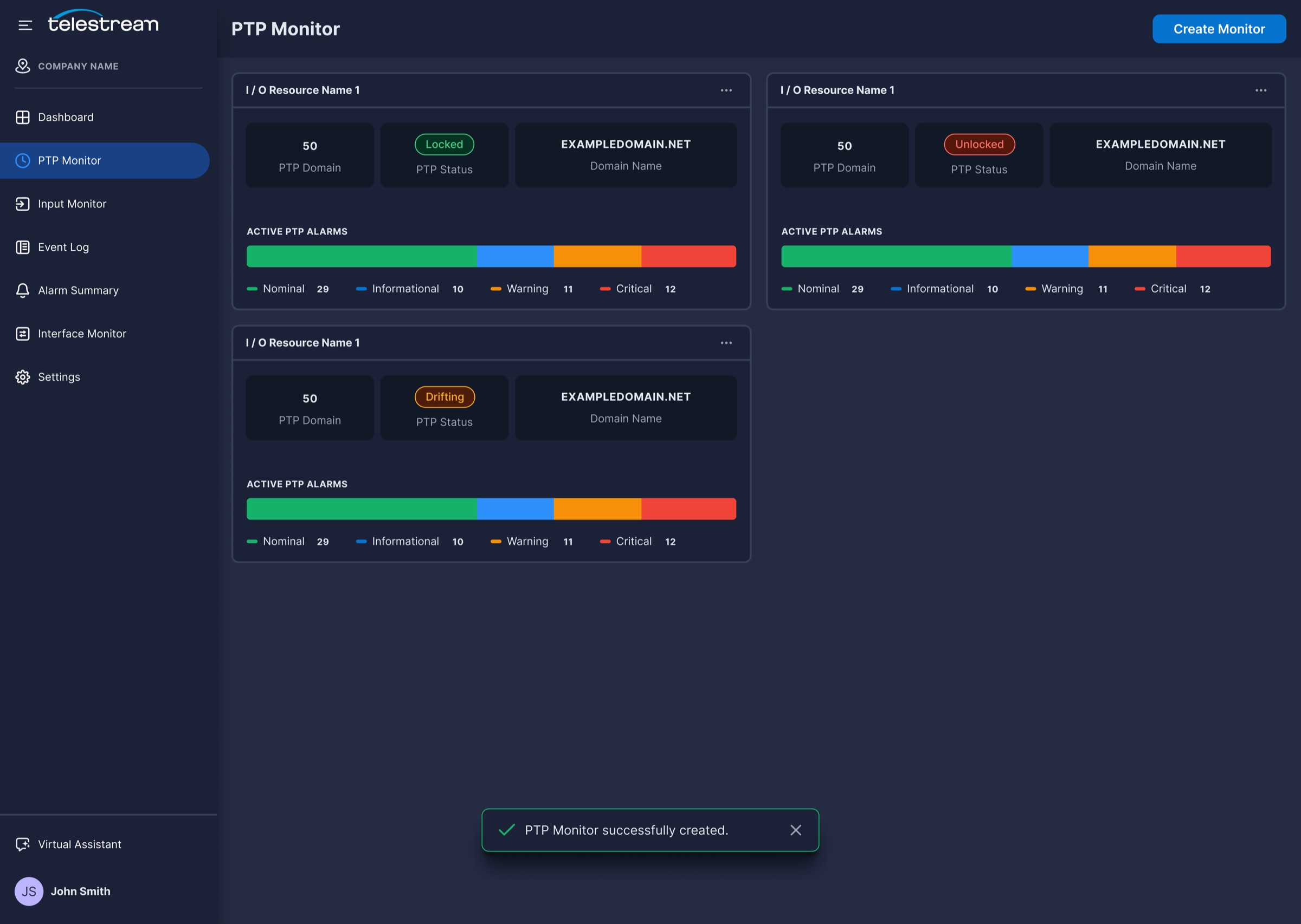
PTP Monitor Cards
Each resource shows its domain, lock status (Locked, Unlocked, or Drifting), and a bar of active alarms by severity.
02
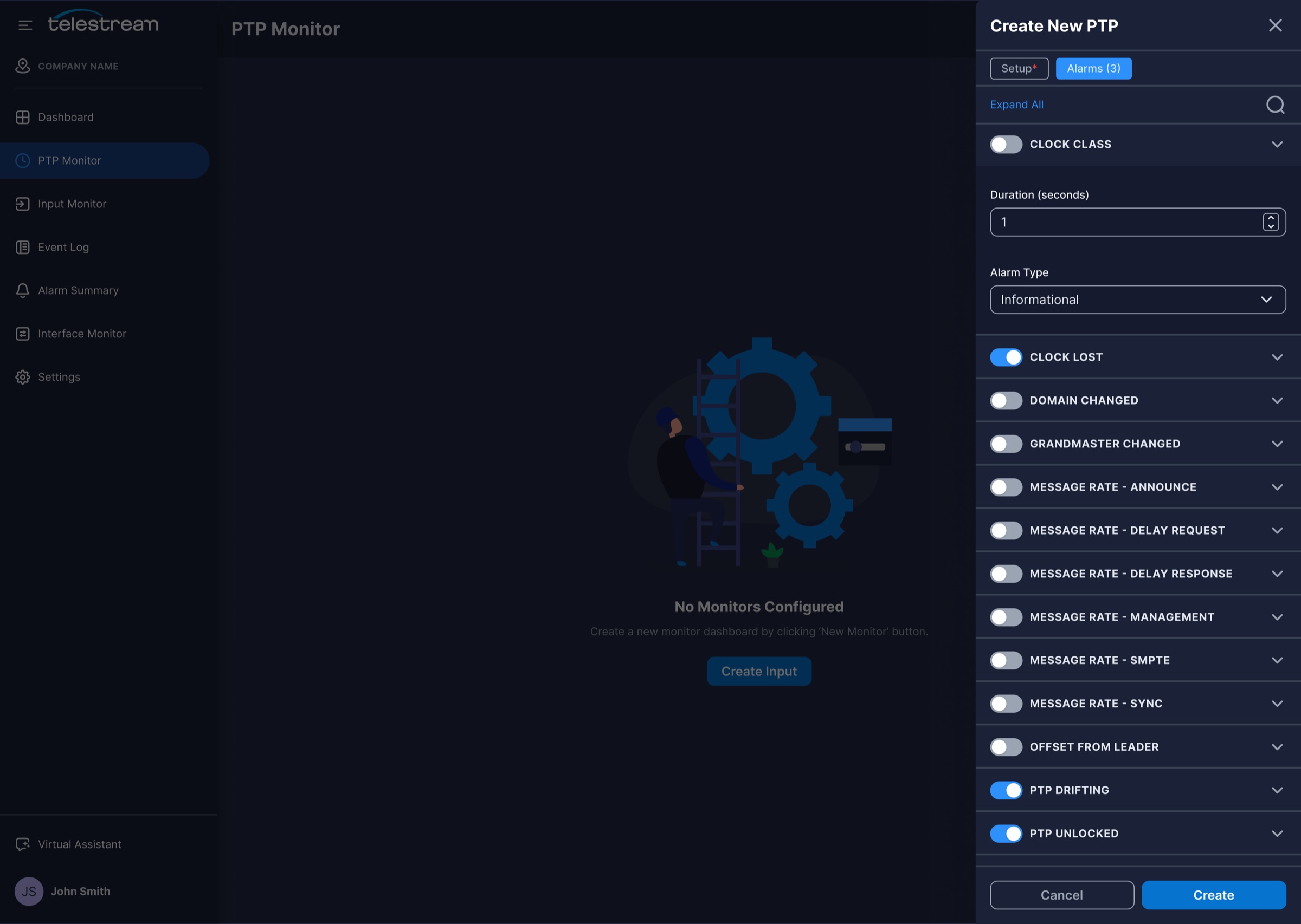
Alarm Setup At Creation
Engineers choose which PTP alarms to track, and set their duration and severity, while creating the monitor.
03
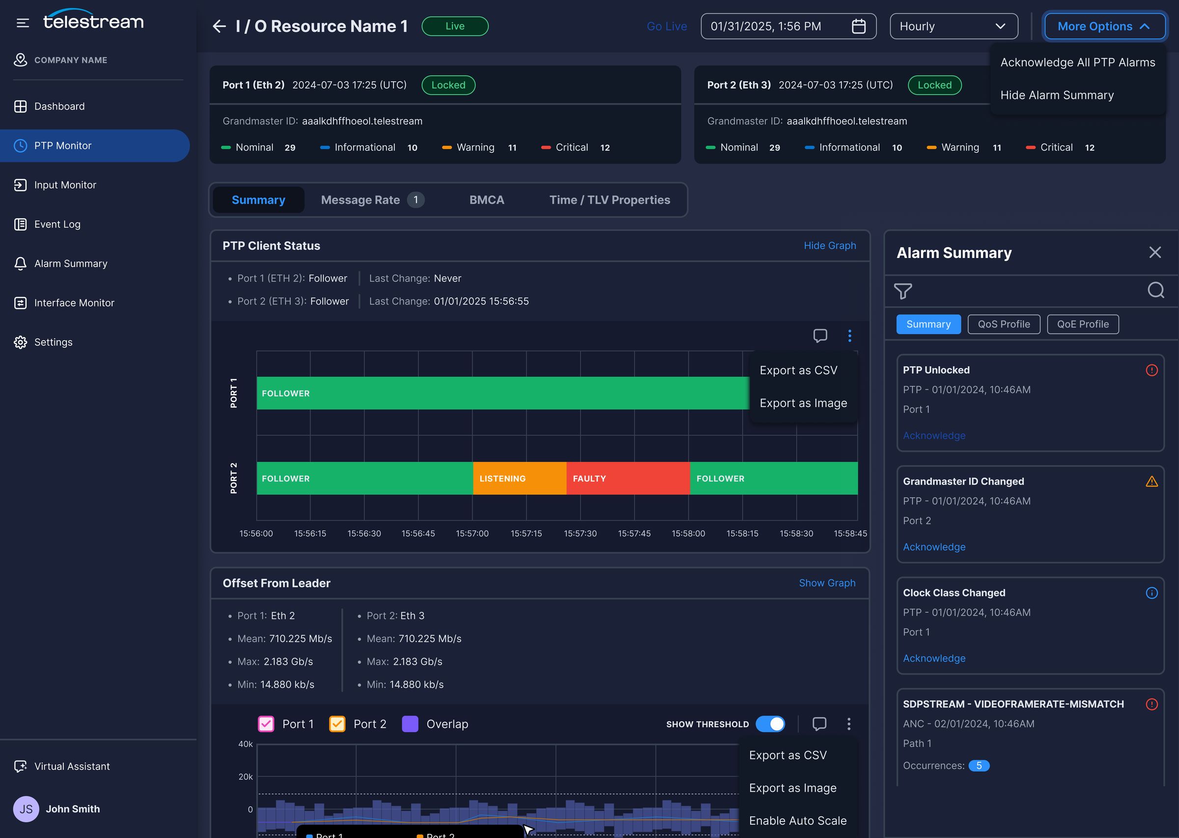
Port-By-Port Timelines
State bars show when a port moved from Follower to Listening or Faulty, with hover details for each change.
04
Live And Historical Views
A date picker and interval control let engineers look back at an incident, then return to live data with Go Live.
05
Collapsible Graphs
Every metric shows its current value and last change, and its graph expands only when it is needed.
pulse.local
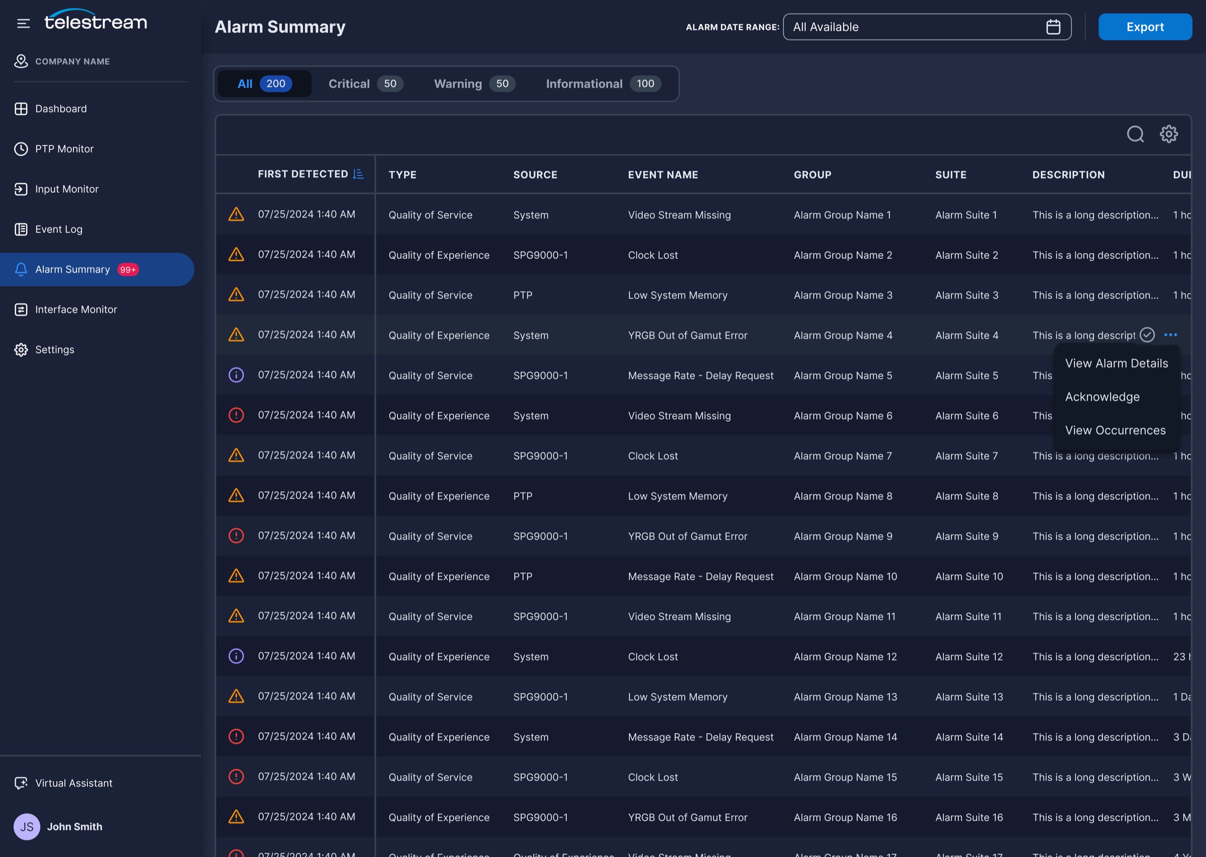
Alarms, Events, And Collaboration
In the legacy tools, an alarm was a red banner. In Pulse, every alarm is a record that can be filtered, investigated, acknowledged, and discussed, with the event log and graph comments preserving what the team learned.
Research signal
Alarm noise and lost context slowed resolution and handoffs.
Design response
A severity-first alarm summary, a searchable event log, and comments attached directly to graphs.
Tabs with counts for Critical, Warning, and Informational alarms help engineers focus on what matters first.
02
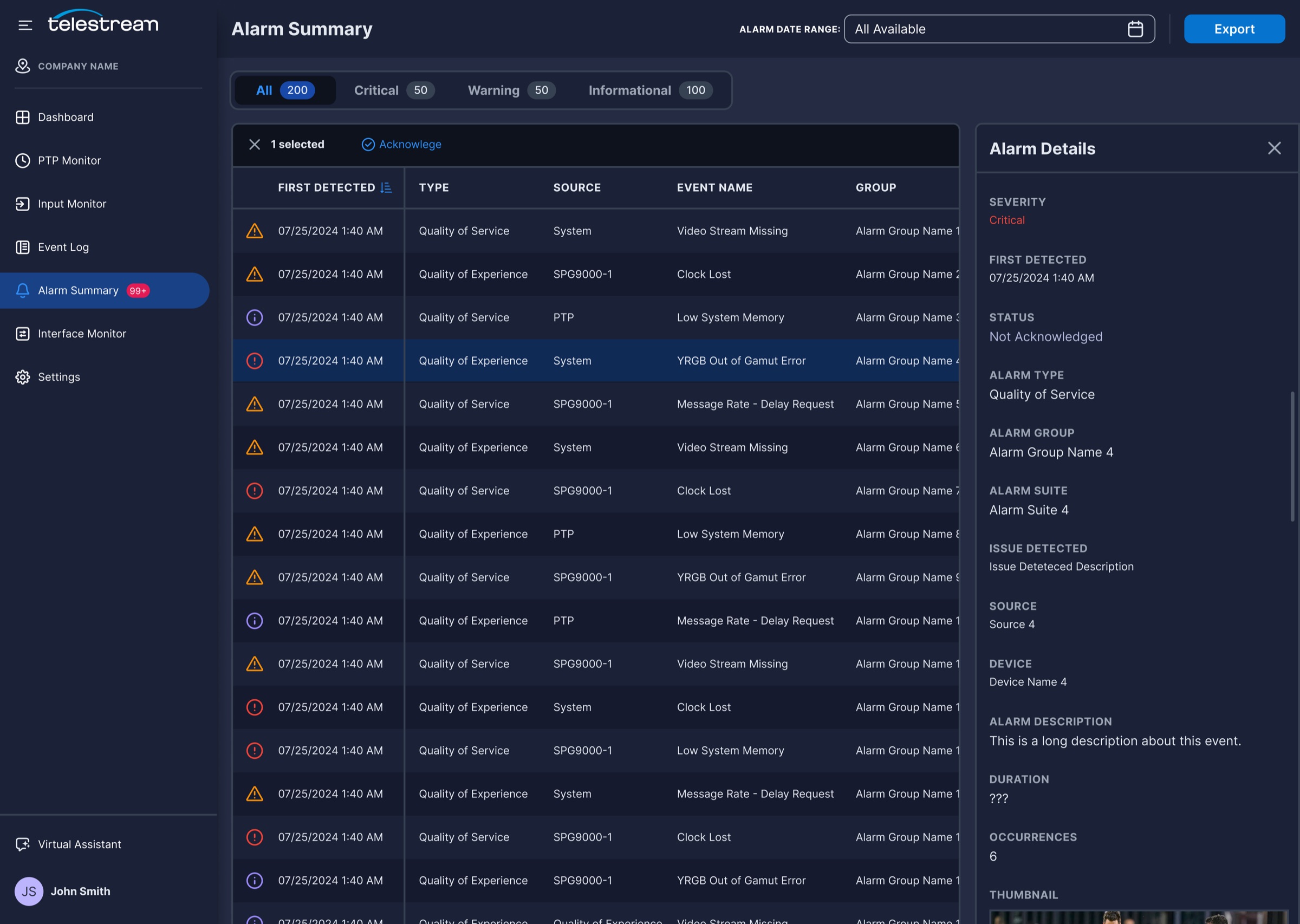
Alarm Details Panel
Selecting an alarm shows its source, device, duration, occurrences, and a video thumbnail without leaving the table.
03
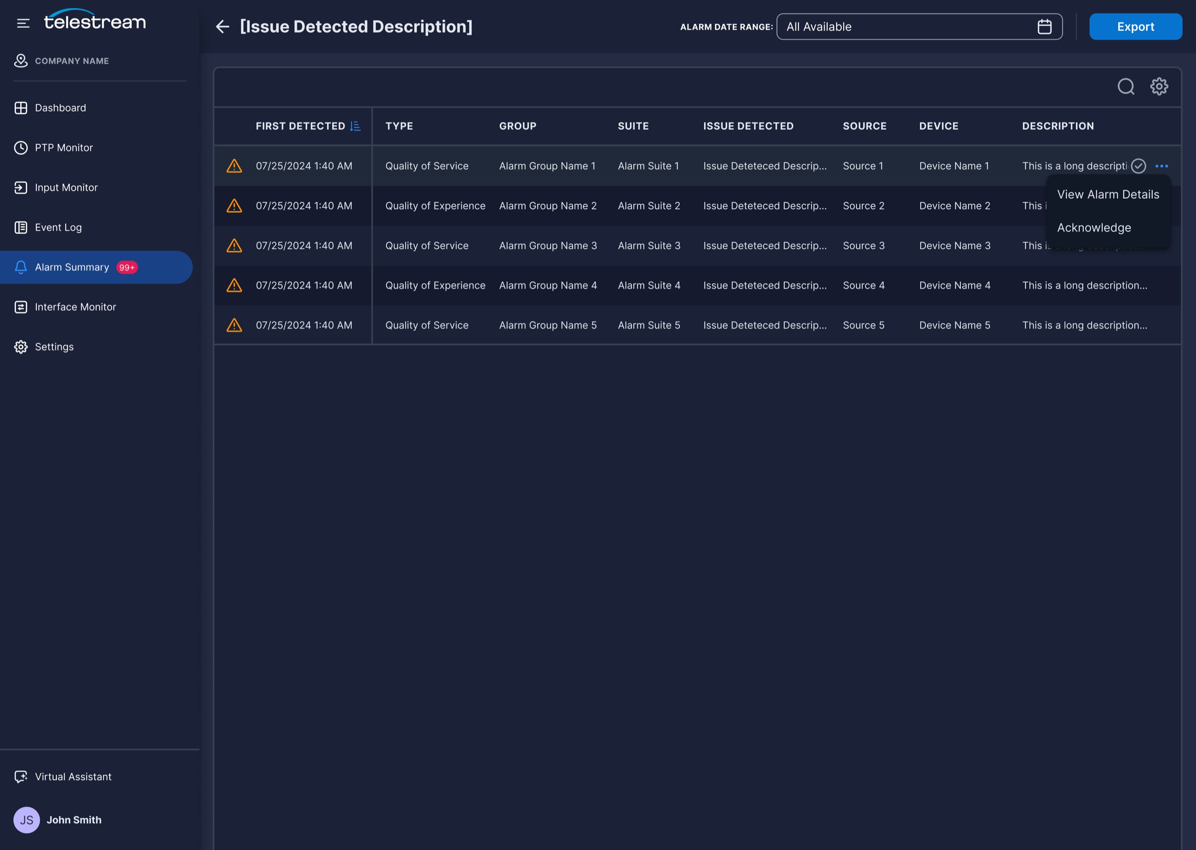
Drill-Down And Acknowledge
Engineers can view every occurrence of an issue, then acknowledge one alarm or many in bulk.
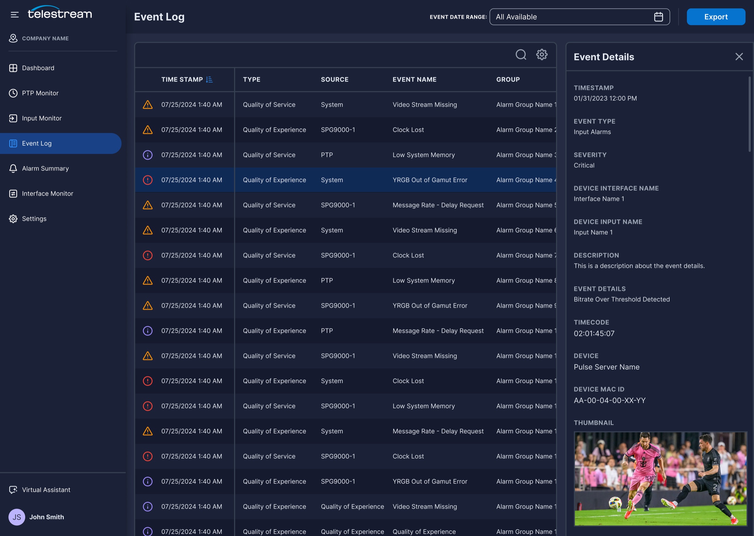
04
Searchable Event Log
Every event is timestamped, filterable by date range, and exportable, with timecode and device details for each entry.
05
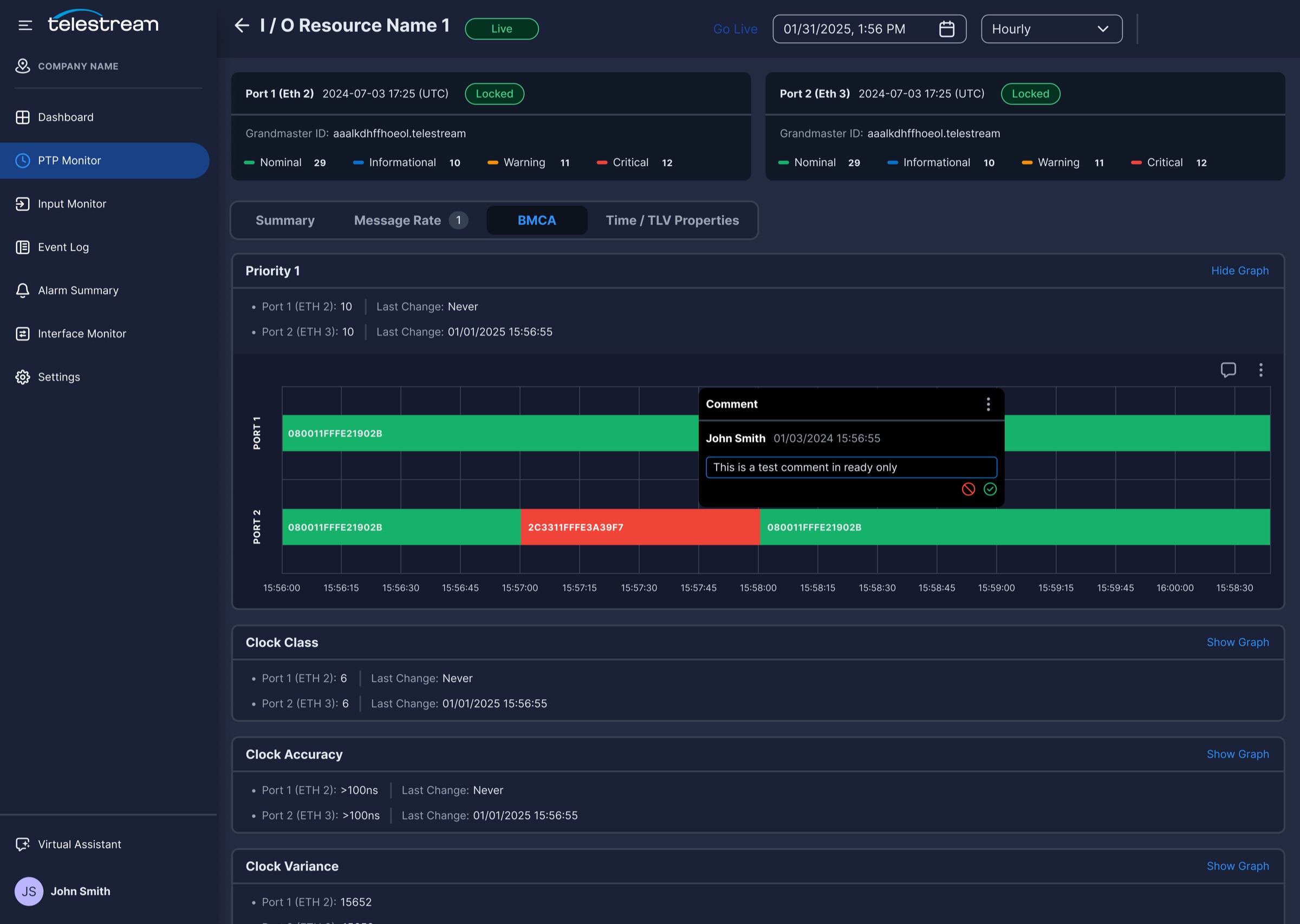
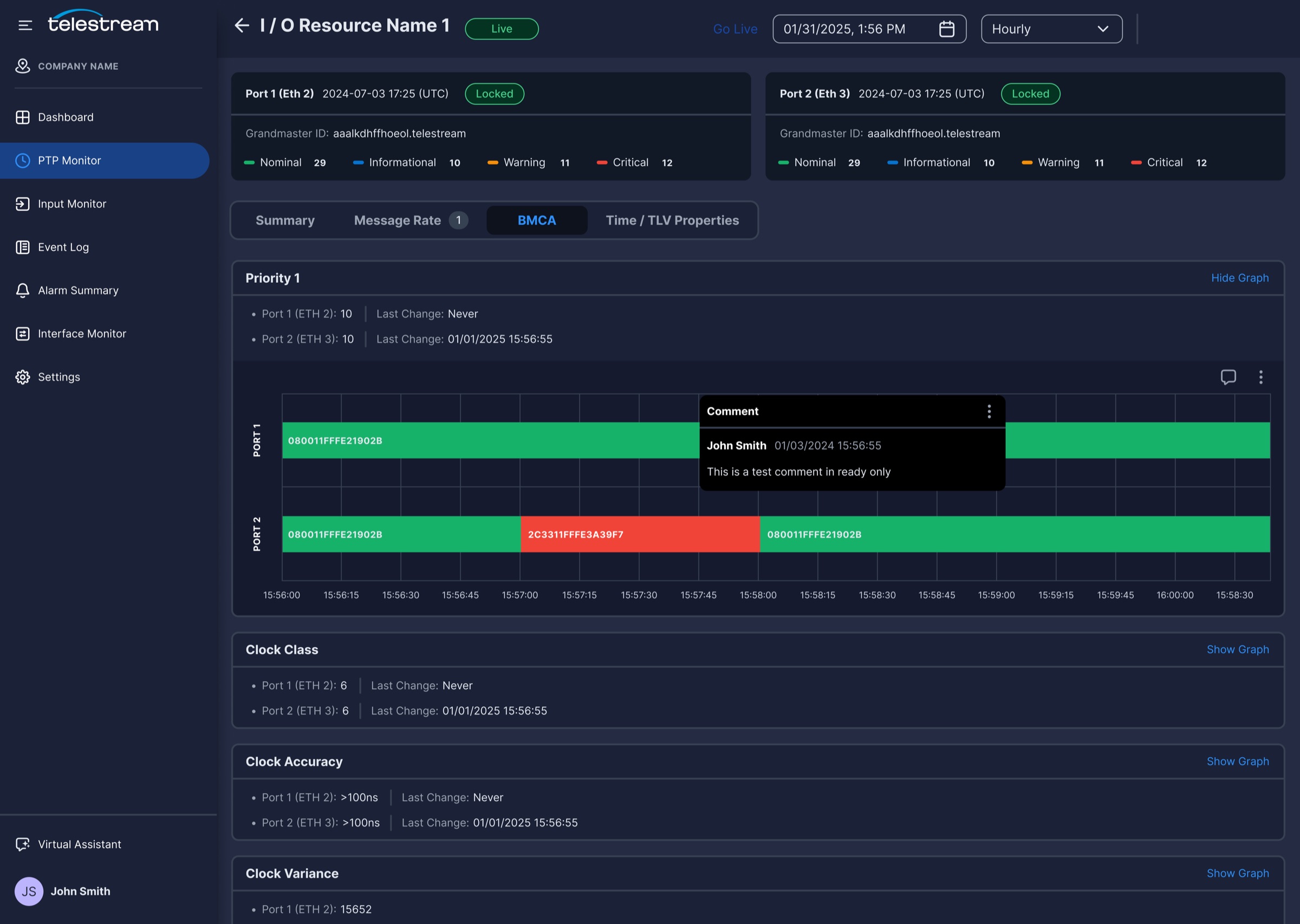
Comments On Graphs
Engineers pin comments to a moment on a graph, so the next person sees what happened and what was already checked.
pulse.local
06
Putting Pulse In Front Of Engineers
Each feature area went through its own round of unmoderated usability testing in UserZoom, built on the same template: a small group of participants, a set of realistic tasks, and three measures. I linked a clickable prototype into each UserZoom study, and participants worked through the tasks on their own while UserZoom recorded their screen, voice, and click paths. After each task, UserZoom asked participants whether they had completed it, which gave me perceived completion. I then reviewed the recordings and click paths to score actual completion. Each study ended with a System Usability Scale survey, also delivered in UserZoom. The gap between perceived and actual completion was the most useful signal, because it showed where engineers felt confident but were quietly going wrong.
Across All Feature Tests
91
Average SUS Score
The average System Usability Scale score across the usability tests of each feature area.
86%
Average Actual Completion Rate
The share of tasks participants actually completed, averaged across the usability tests of each feature area.
2m 27s
Average Time On Task
How long participants took to complete each task, averaged across the usability tests of each feature area.
4.2
Average Difficulty Rating
How difficult participants rated each task, averaged across the usability tests of each feature area.
07
What Pulse Taught Me
01
Hierarchy beats more screens
Status colors, severity counts, and “last changed” timestamps did more to speed up scanning than adding new views ever would have.
02
Connect the two expert views
Broadcast and IP specialists look at the same incident from different sides. Putting signal and network data on one page gave them a shared picture.
03
Watch the perception gap
Participants felt successful more often than they were. Measuring actual completion alongside SUS caught problems a satisfaction score alone would have hidden.
What I delivered
End-to-end design for Dashboards, Input Monitor, PTP Monitor, and Alarms, all of which shipped.
A secure, on-premise web experience that replaced hardware-only monitoring.
A shared navigation and design language across the product.
Customer interviews, three personas, and usability testing for every feature area.

 Design Problem