A weak product proposition
Customers could find cheaper alternatives, while iTracefresh’s stronger capabilities felt scattered across separate modules. This made it difficult for customers to understand the value of paying more.

I led a redesign of the labeling workflow and the surrounding traceability experience to make the product easier to use and more valuable to growers.
iTracefresh had valuable traceability capabilities, but customers experienced them as disconnected tools. The most-used workflow, creating labels, was slow to learn and costly to operate, while lower-priced competitors offered a more coherent end-to-end product.
Customers could find cheaper alternatives, while iTracefresh’s stronger capabilities felt scattered across separate modules. This made it difficult for customers to understand the value of paying more.
Creating labels was the most-used workflow, yet it was slow, error-prone, and difficult for new users to learn. This friction affected onboarding, daily operations, and support.
The redesign needed to preserve operational familiarity, meet PTI and FSMA traceability requirements, and avoid disrupting active work for growers and packing crews.
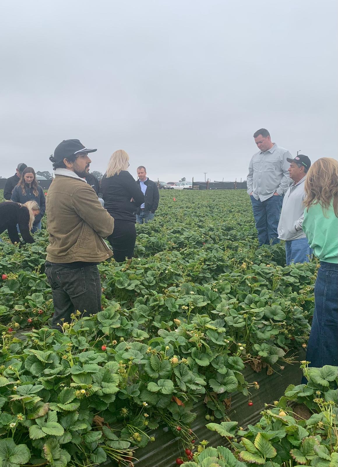
Spent a day on-site at a California Giant Berry Farm observing and interviewing harvest and operations teams to understand the real-world workflow. Because subject-matter expert time was limited, I used field observation, focused interviews, and workflow mapping to make each research session count.
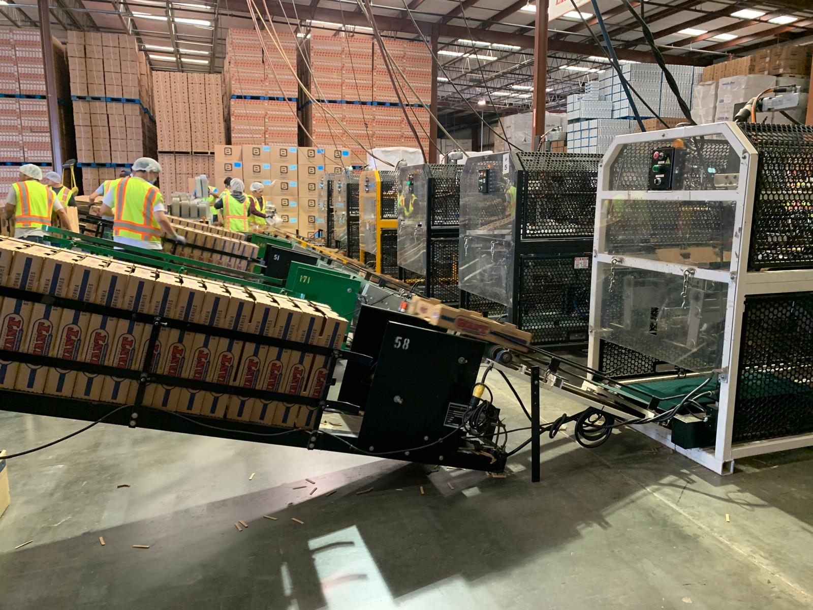
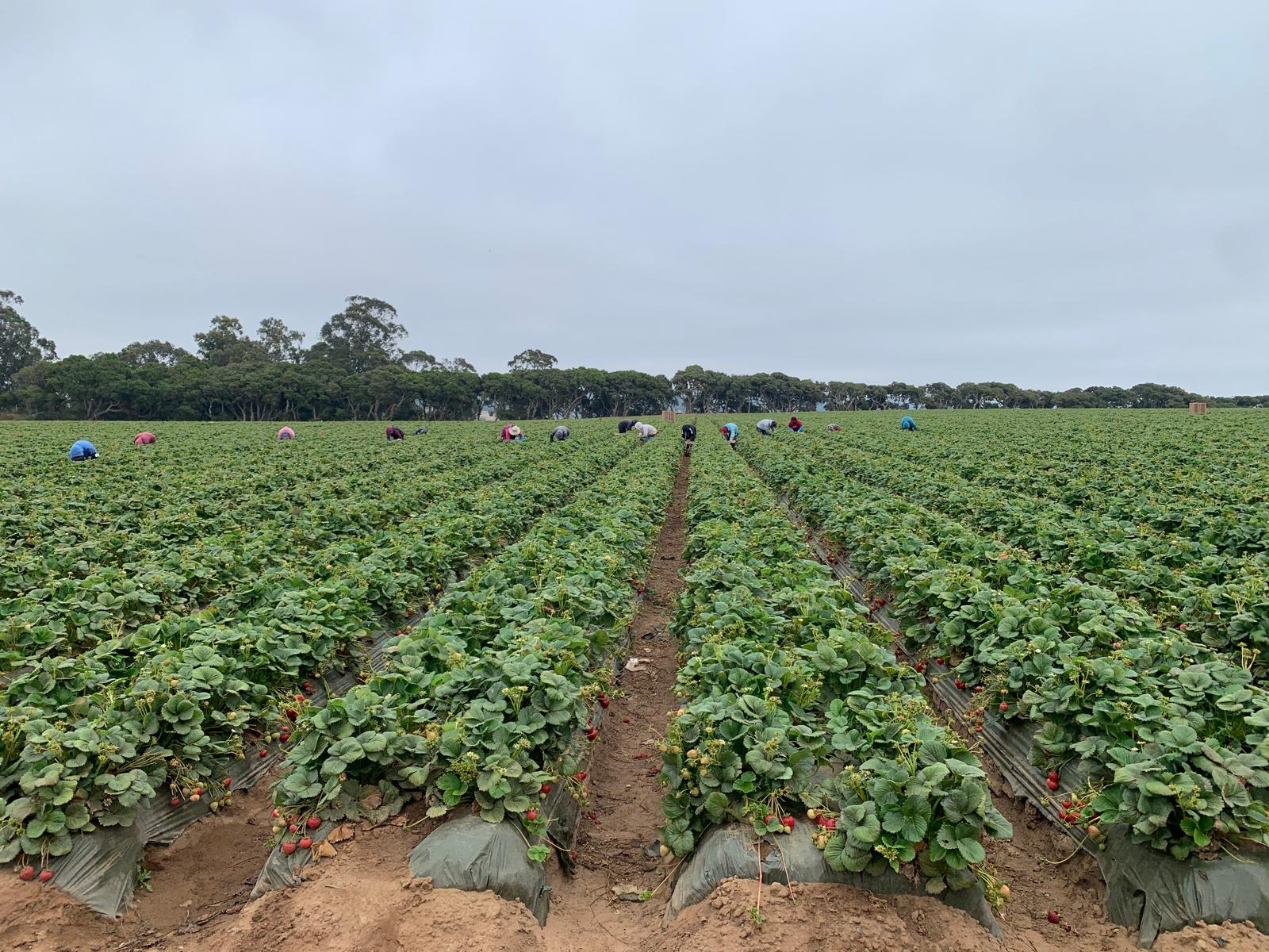
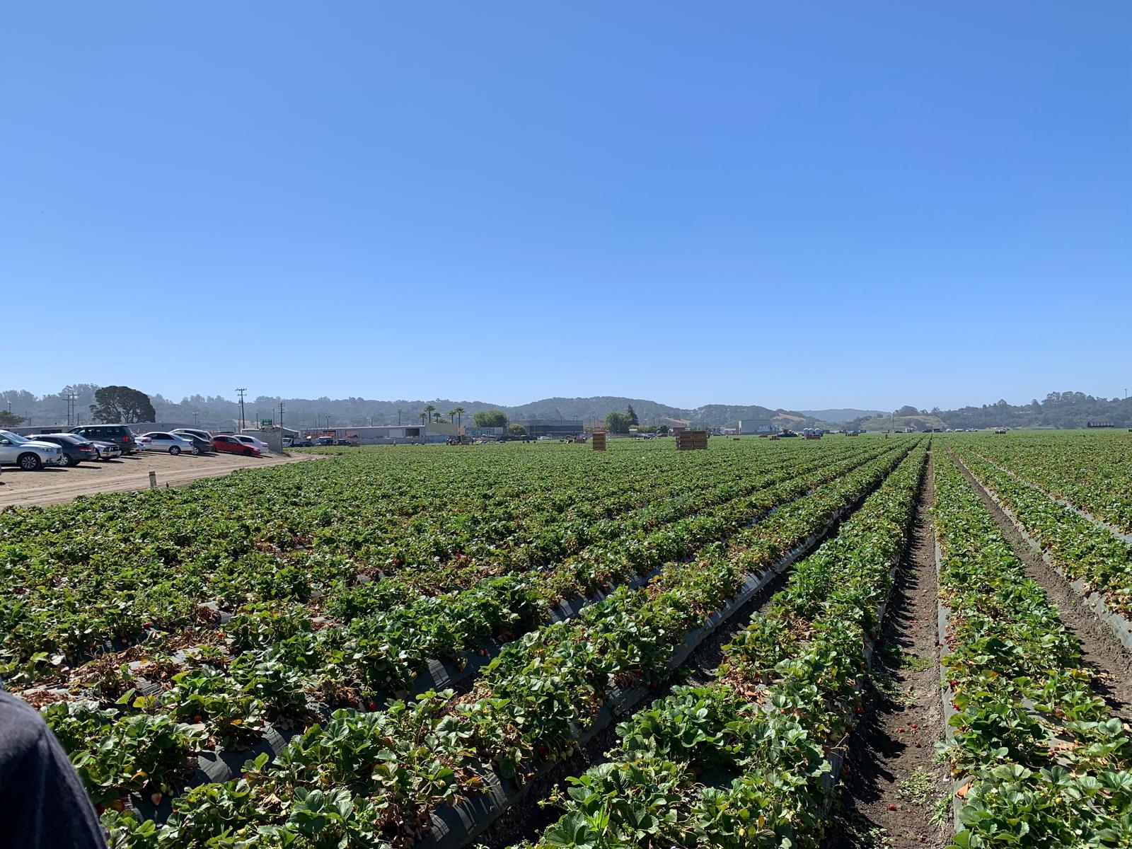
Our customers' pain points were our opportunities. Our interviews helped us uncover the path to our goals.
Workflow mapping revealed two major time sinks:
These tasks consumed 6.5 hours of the shift, exposing significant workflow friction. A lack of real-time visibility left crews guessing about supplies, progress, and quotas—while operations teams lacked timely insight into production and quality issues.
iTracefresh wasn't behind on capability. It held features most competitors didn't but those solutions were scattered across separate, disconnected modules, while competitors like Procurant and Famous ERP won on being one unified system.
| Feature | iTracefresh | iFoodDS / HarvestMark | Famous Software | FoodLogiQ | Procurant |
|---|---|---|---|---|---|
| PTI printing | ✓ | ✓ | ✓ | ✓ | ✓ |
| Item-level trace | ✓ | ✓ | — | — | — |
| Palletized ASN | ✓ | — | ✓ | ✓ | — |
| Mobile printing (Android) | ✓ | — | ✓ | — | ✓ |
| Offline mobile printing | ✓ | — | — | — | — |
| HPL printing | ✓ | — | ✓ | — | — |
| Item lookup tool | ✓ | — | — | — | — |
| Lot aggregator (coming soon) | ✓ | — | ✓ | ✓ | — |
Research showed that iTracefresh did not lack capability; it lacked a connected experience. I focused the redesign on making core labeling faster, bringing related workflows into one product structure, and giving growers clearer tools to manage customer engagement and recall events.


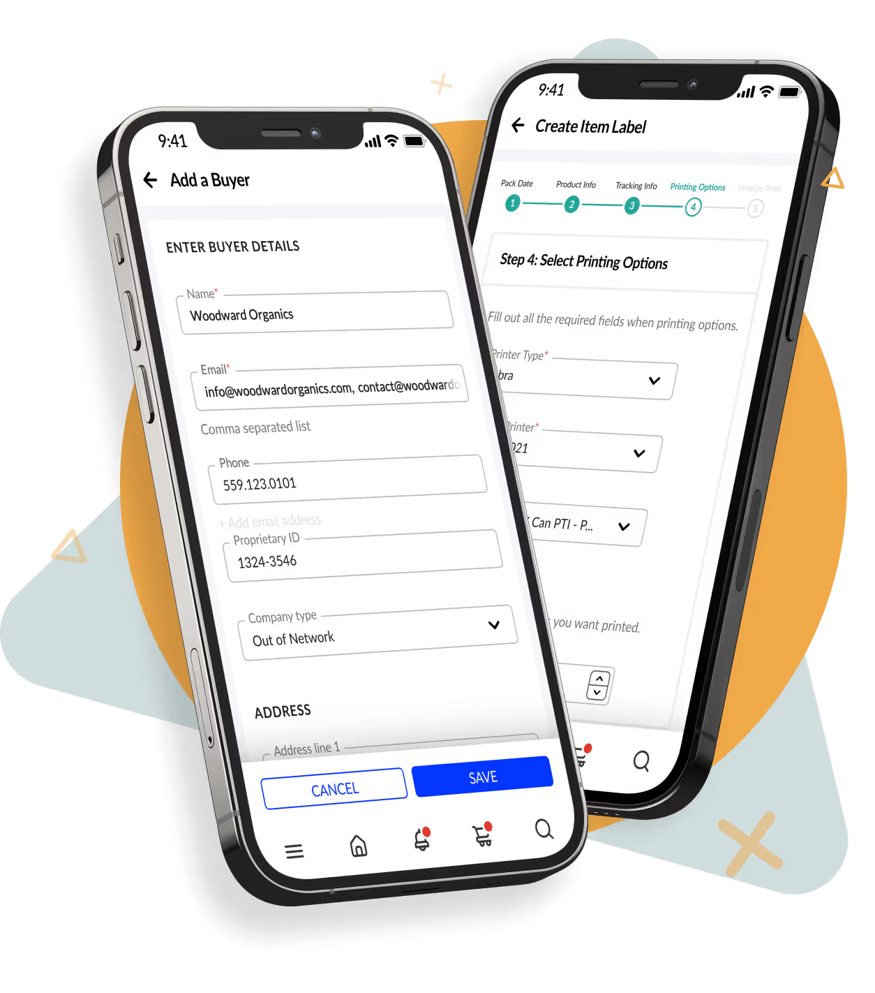
Create and find PTI, hybrid pallet, and SSCC labels in one place. Guided creation, scanning and activation, and trace summary reporting carry the workflow from setup through tracking.
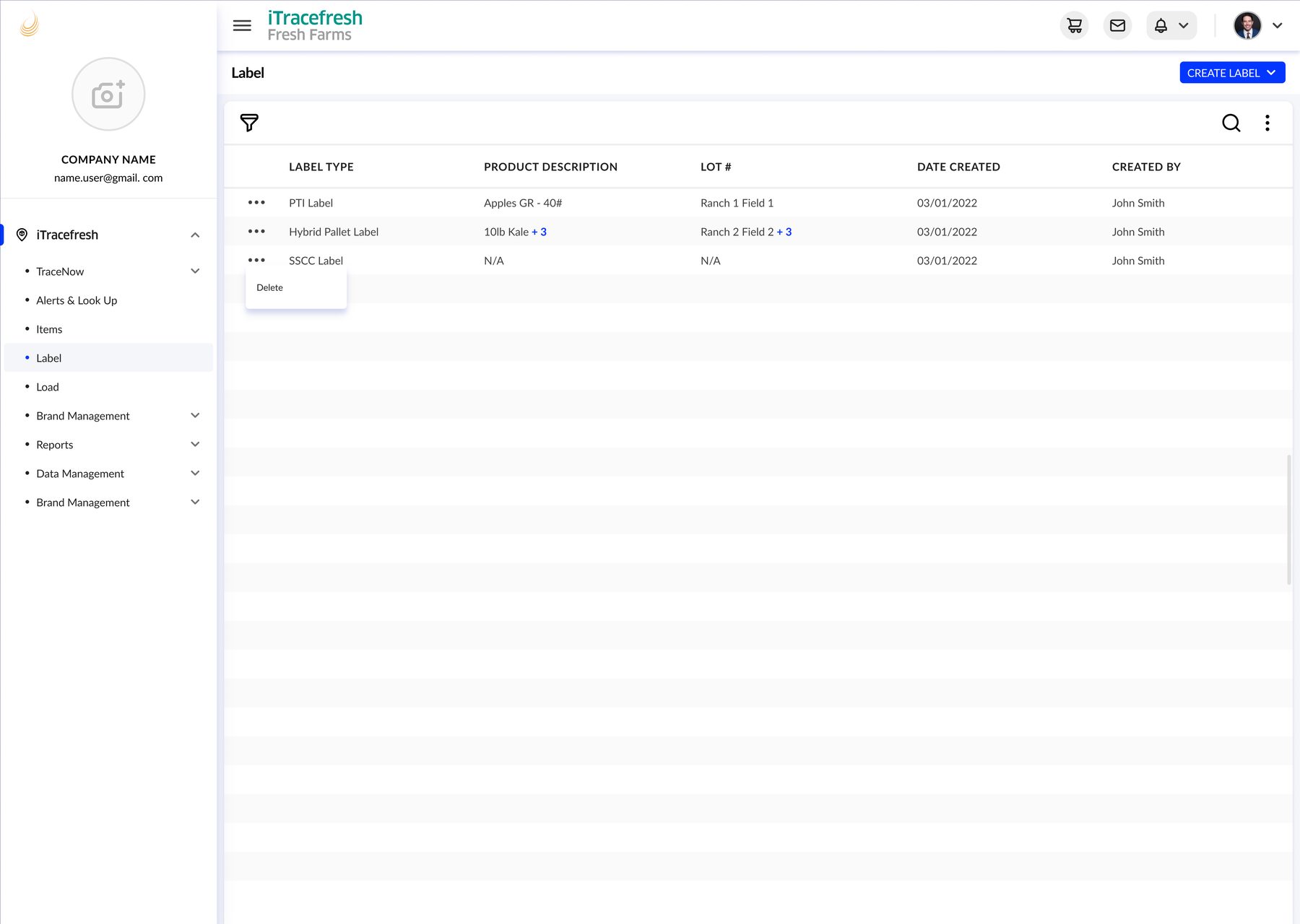
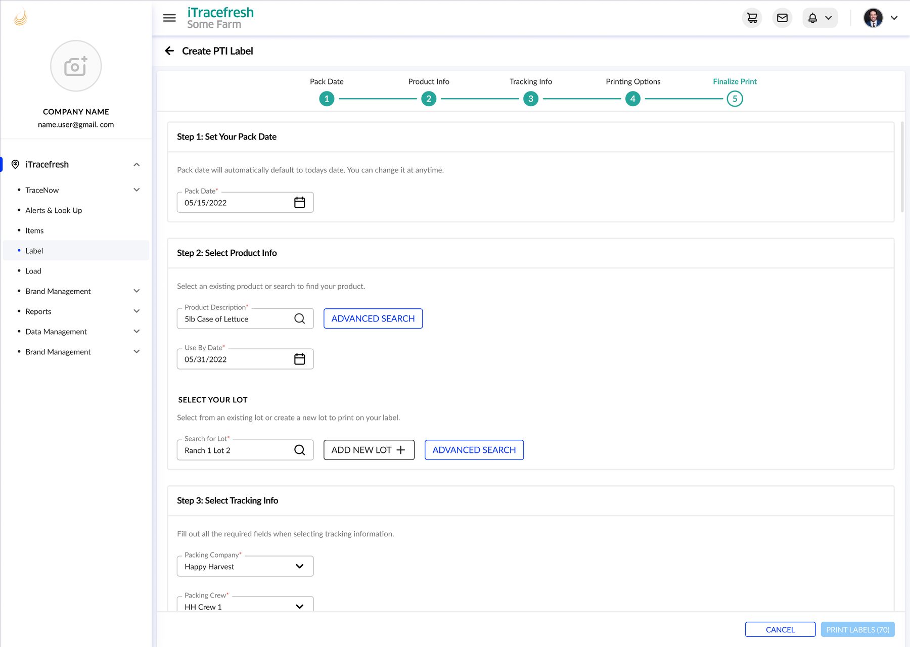
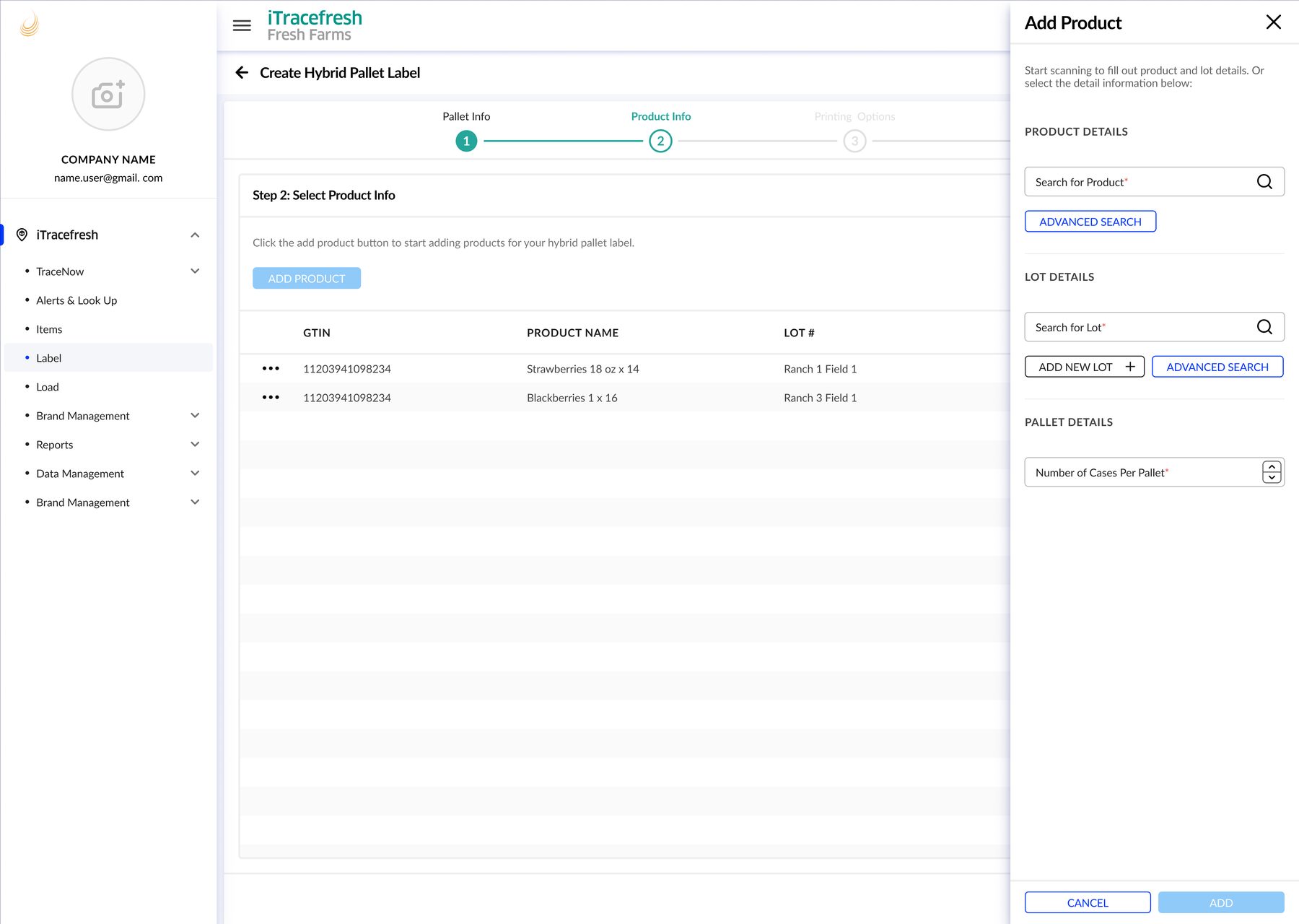
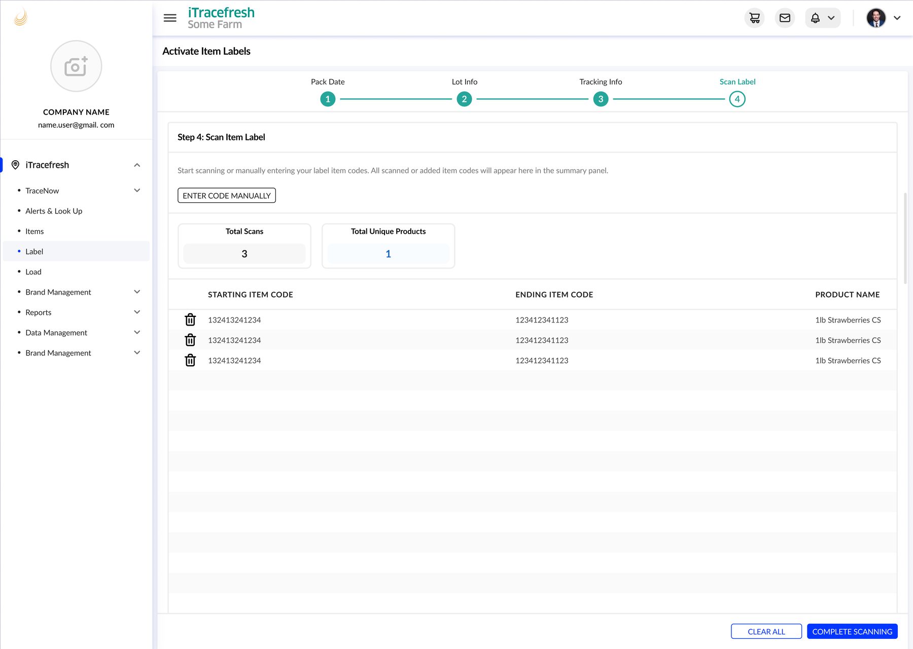
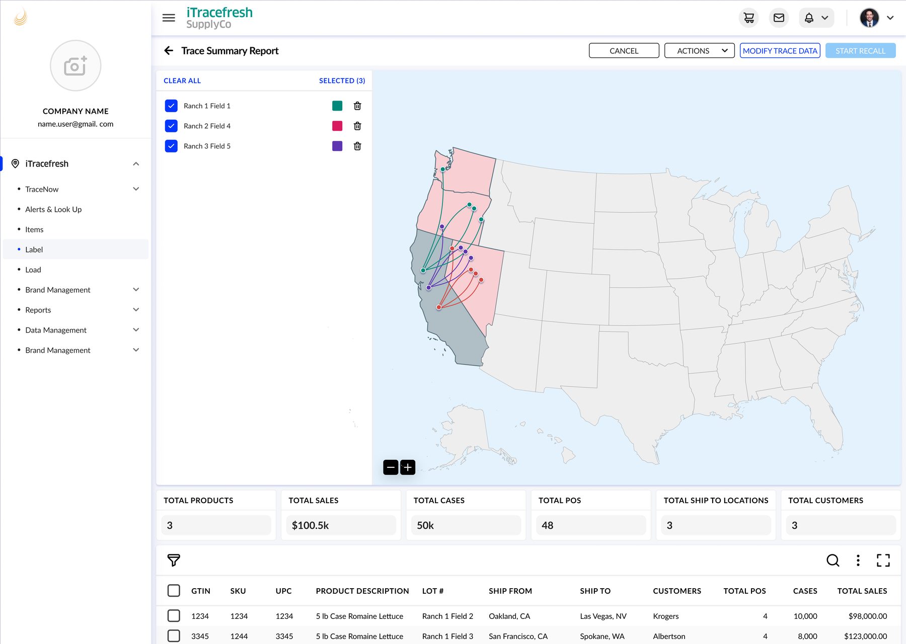
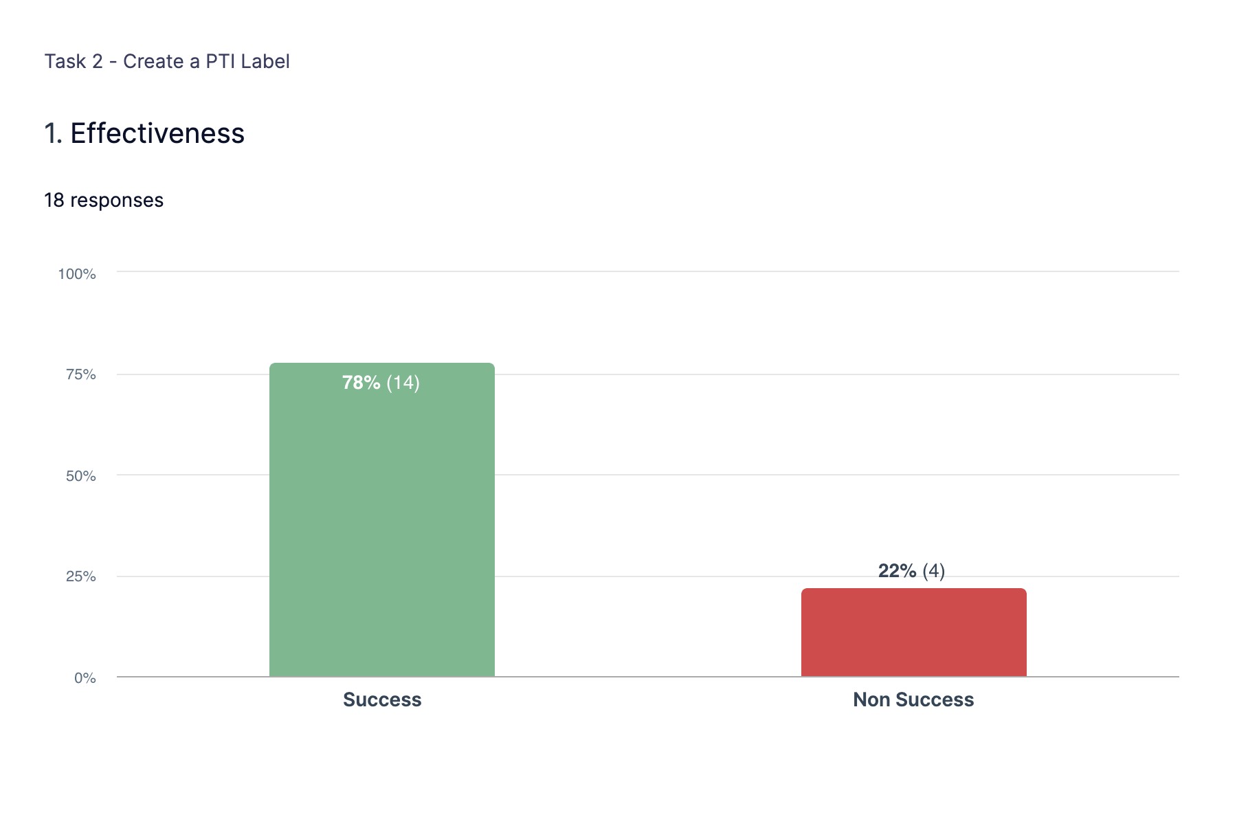
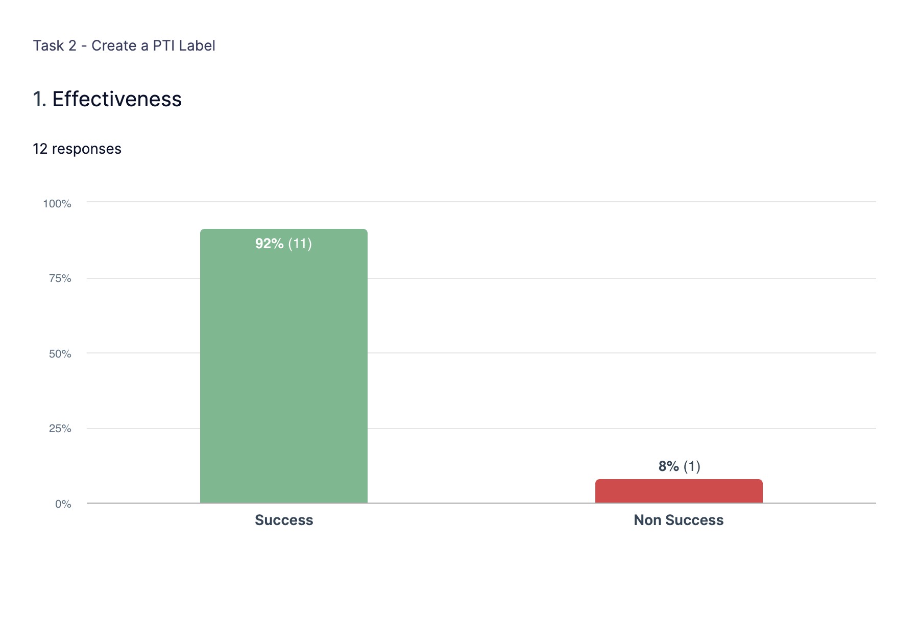
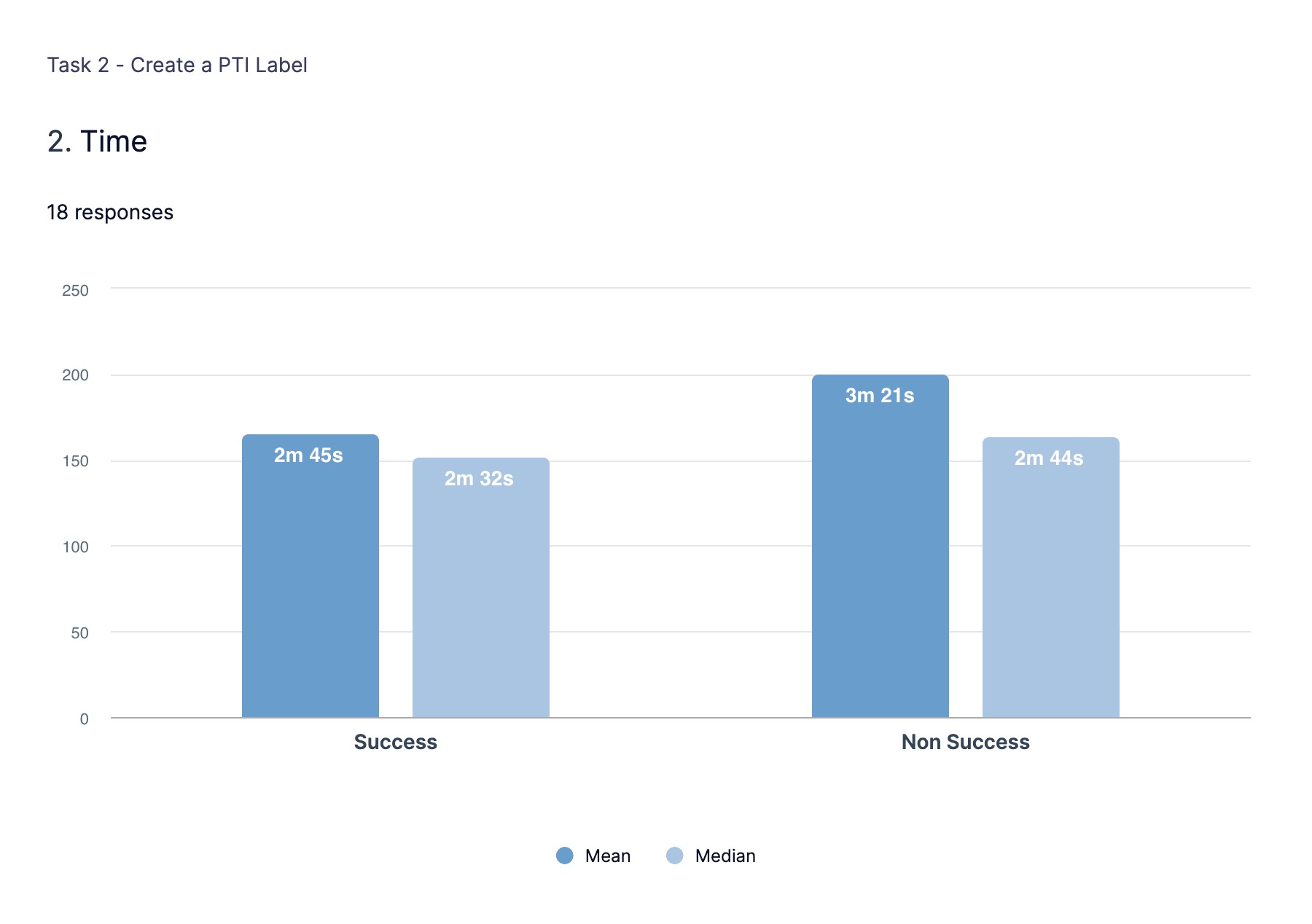
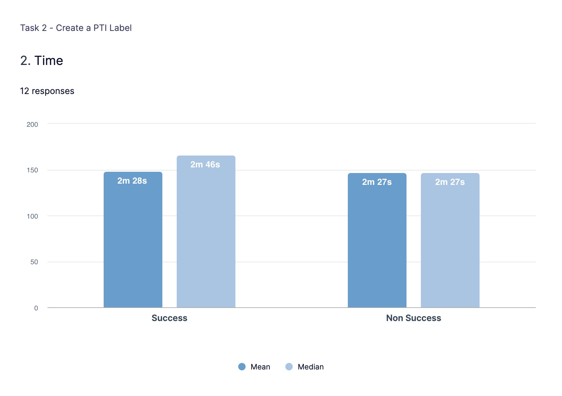
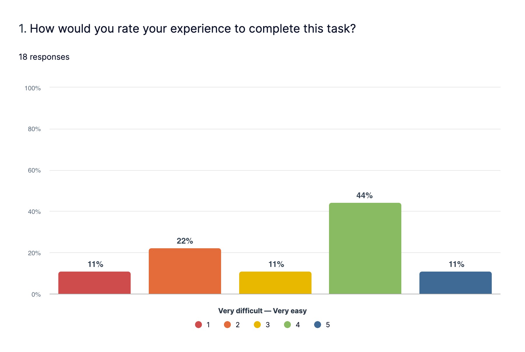
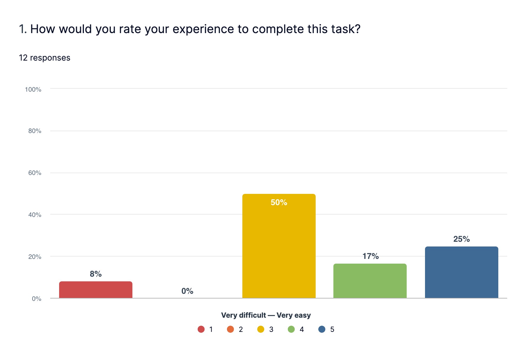
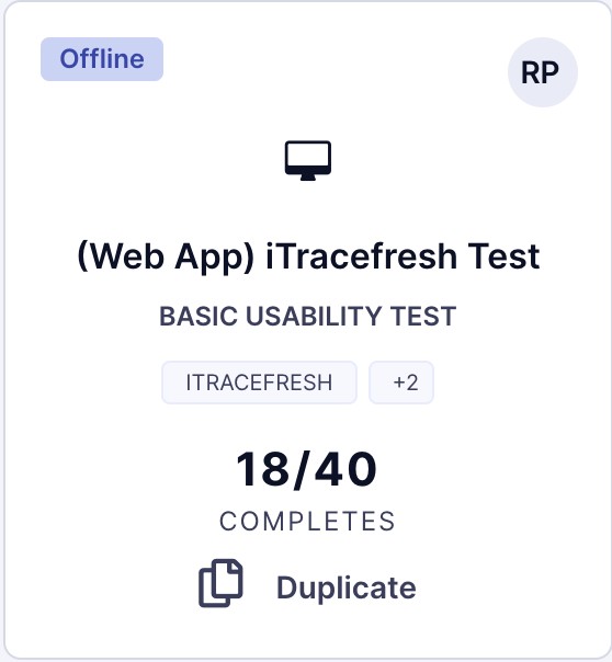
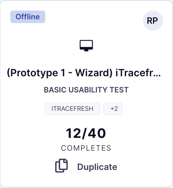
Test legacy iTracefresh application against the new designed solution for creating labels.
Conducted unmoderated usability testing through a 3rd party application on UserZoom.
18 participants completed the legacy test and 12 completed the prototype test.
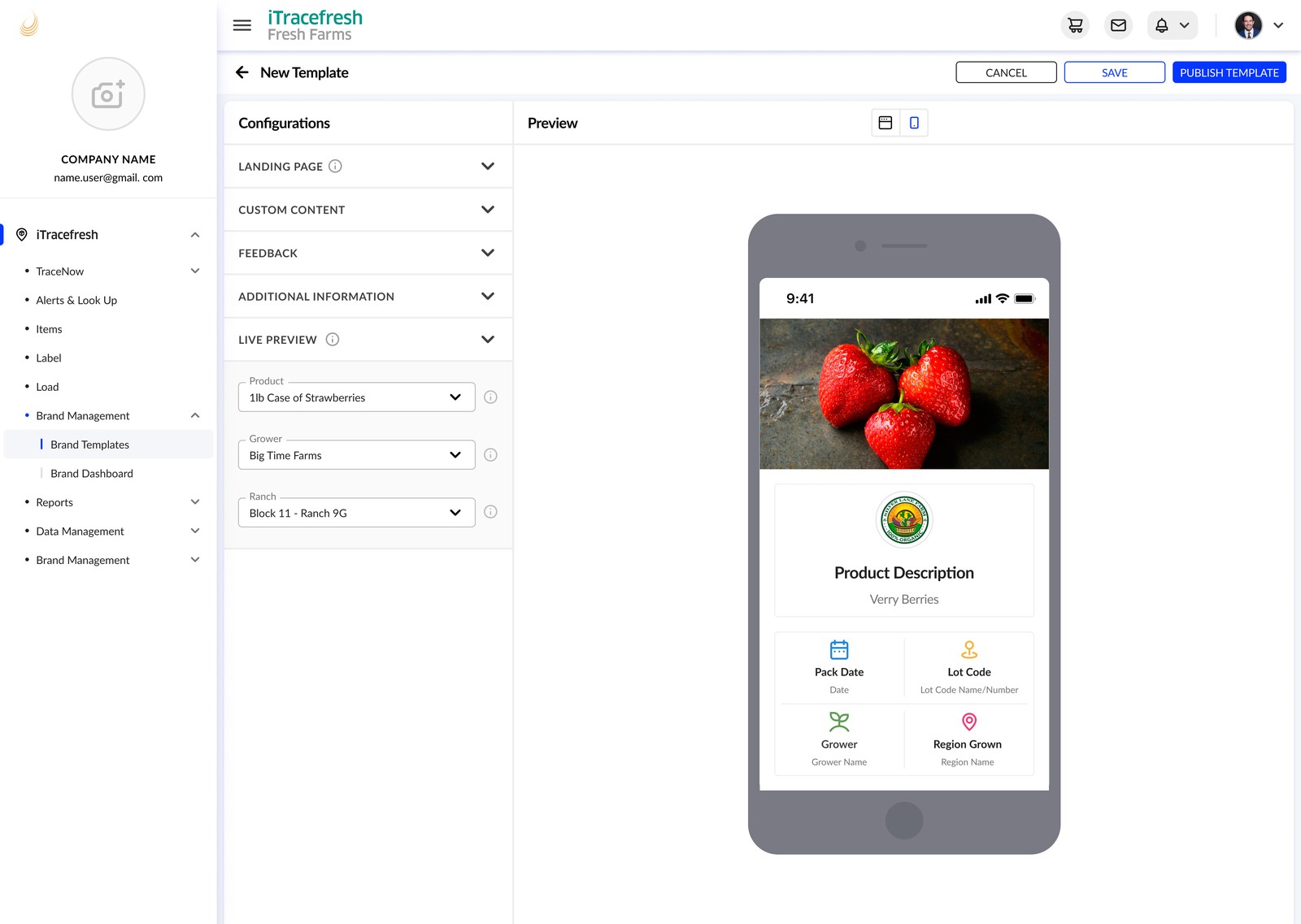
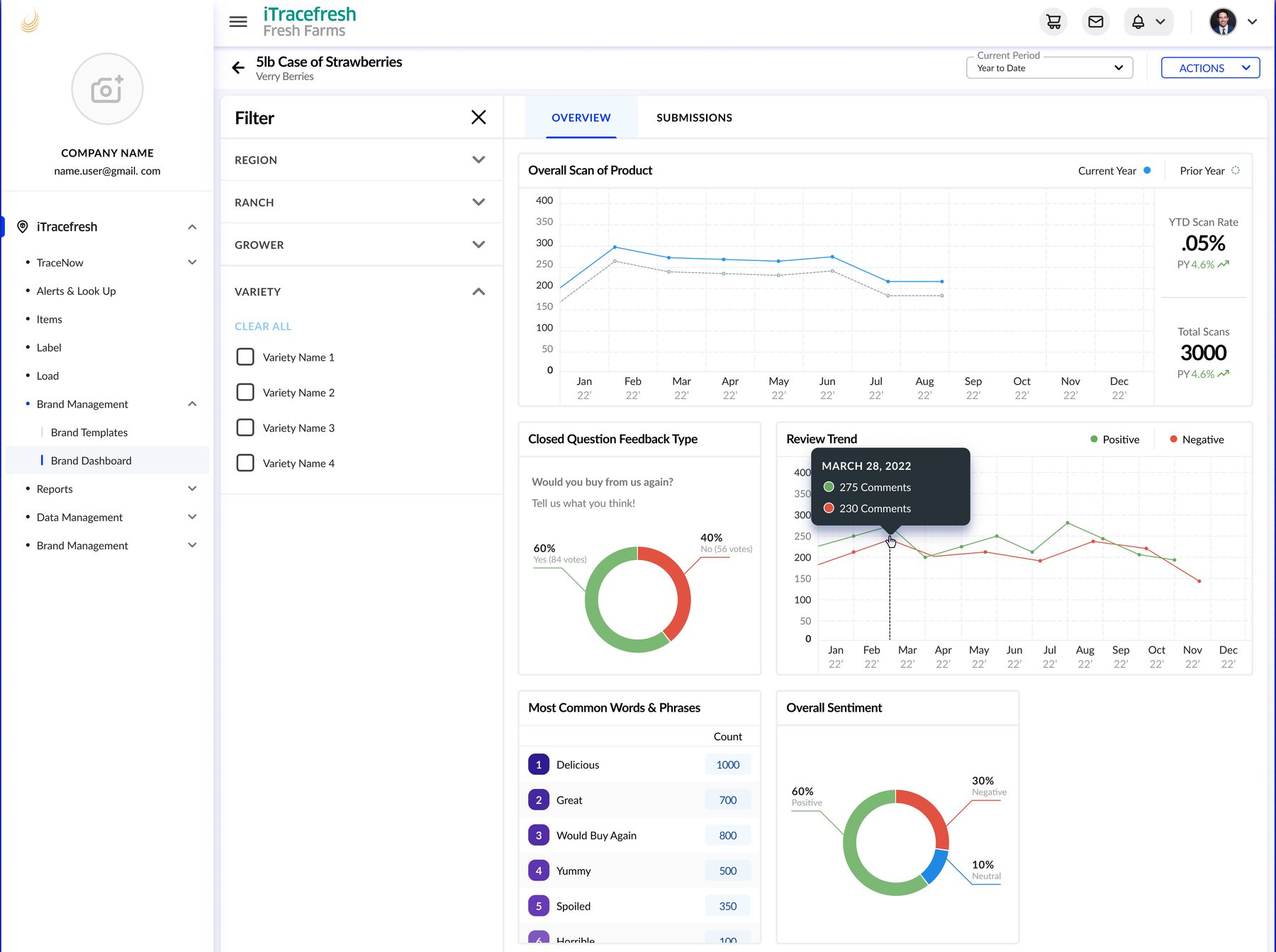
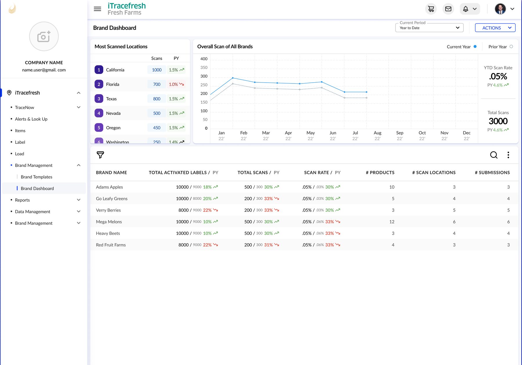
Configure brand templates with a live preview, then review scan trends, customer feedback, and performance across brands in the overview and dashboard.
Growers wanted their branding to carry beyond the warehouse to the moment a customer engages with the product.
Self-service template configuration supports branded web and mobile experiences.
Live template preview · Brand overview · Cross-brand dashboard
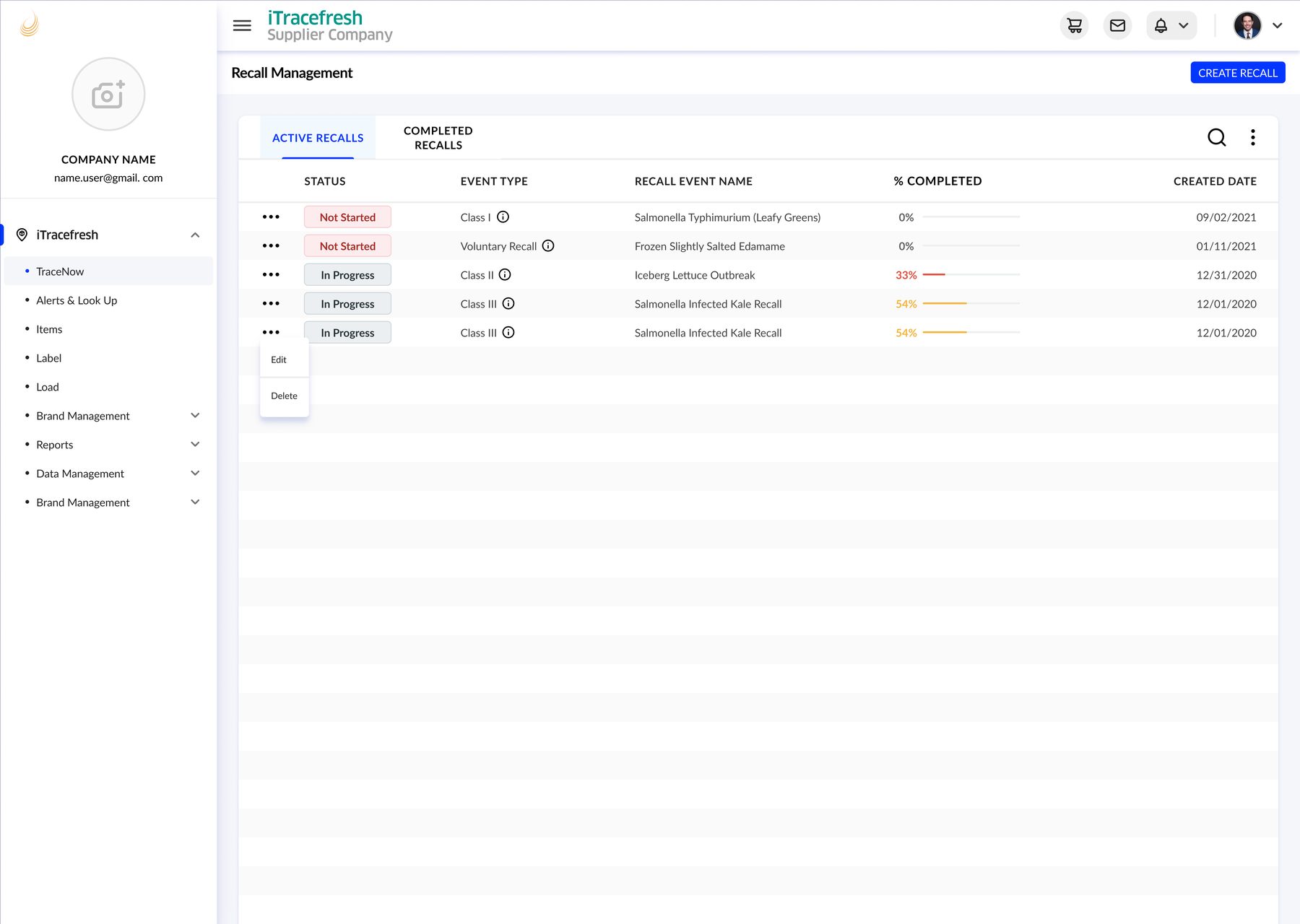
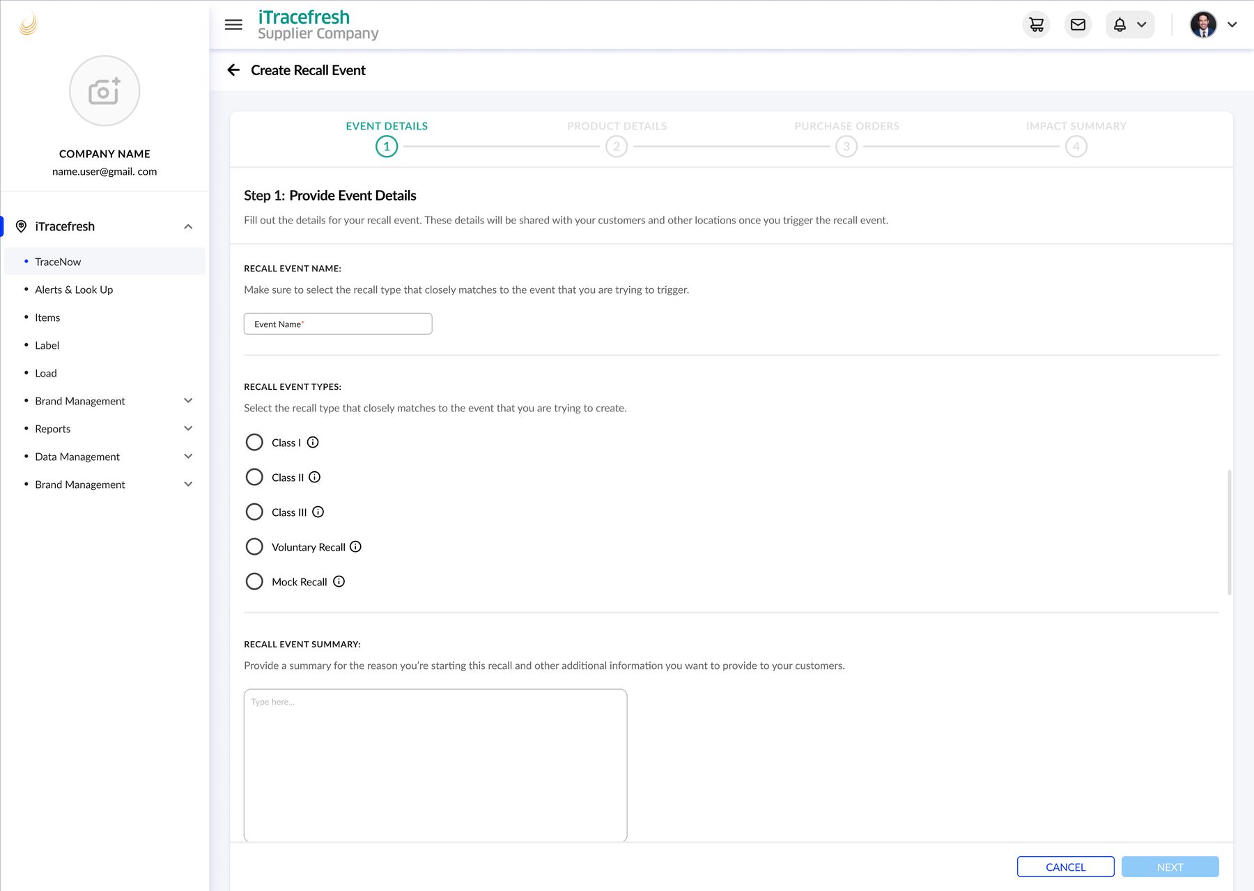
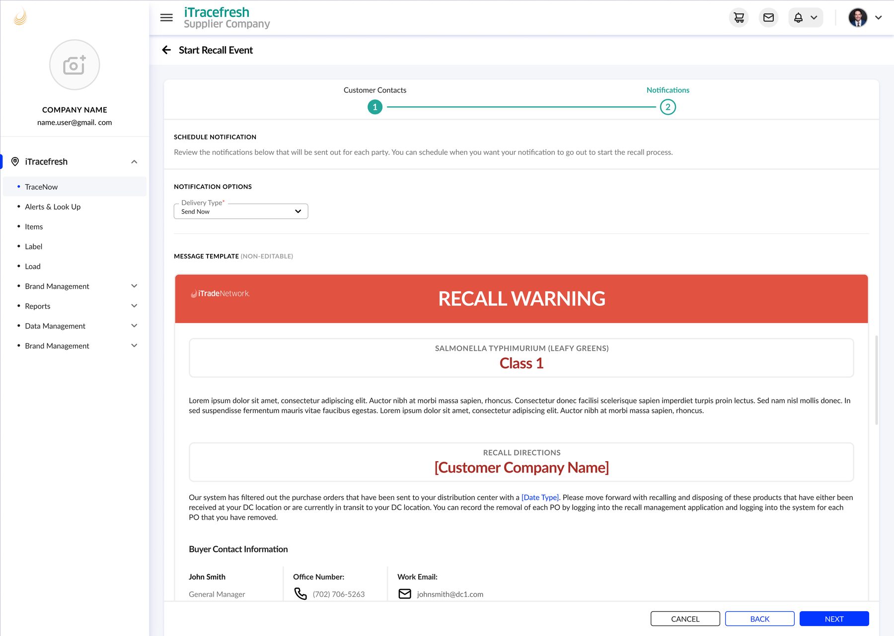
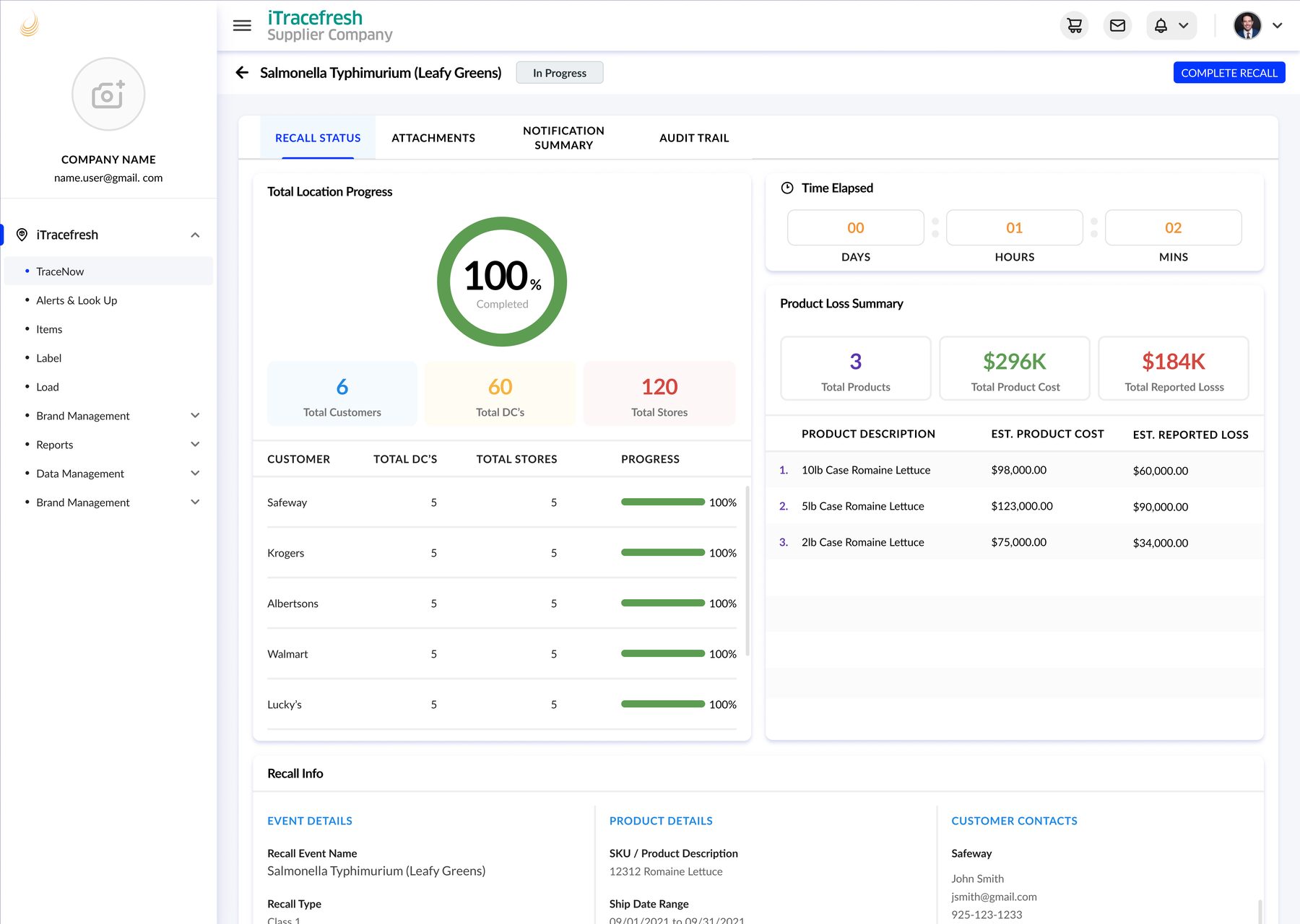
Create and monitor recall events in one place. The flow brings together guided setup, customer notifications, progress and impact tracking, and attachments for the response.
Growers needed a way to respond quickly to food-borne illnesses or contamination events.
A centralized recall flow brings event setup, notifications, status tracking, and attachments together.
Recall dashboard · Guided event creation · Notifications · Status tracking · Attachments

Redesigning iTracefresh taught me that improving an operational product required more than modernizing its interface. I needed to understand the work in context, prioritize the workflow with the greatest customer impact, and connect existing capabilities into a more coherent product.
Watching harvest and operations teams in the field showed me that labeling was only one step within a time-sensitive physical workflow. Seeing that environment helped me design around real constraints instead of assumptions.
Label creation was the most-used feature and a major source of customer frustration. Prioritizing and validating that workflow gave the broader product redesign a measurable foundation.
Experienced crews already understood the concepts and sequence behind label creation. The redesign added guidance, visible progress, and automation while preserving the familiar structure users relied on.
iTracefresh already had strong capabilities, but they were scattered across separate modules. Connecting labeling, brand engagement, and recall response around shared traceability data created a clearer and more valuable product experience.